ACC Visual Communications Grad Showcase ‘24
It was such an honor to be commissioned by the Visual Communications department at ACC to design the print collateral for the 2024 Portfolio Grad Show. From the get-go I knew that I wanted to consider my fellow design students, the people who inspired my degree journey and have become such special people to me.
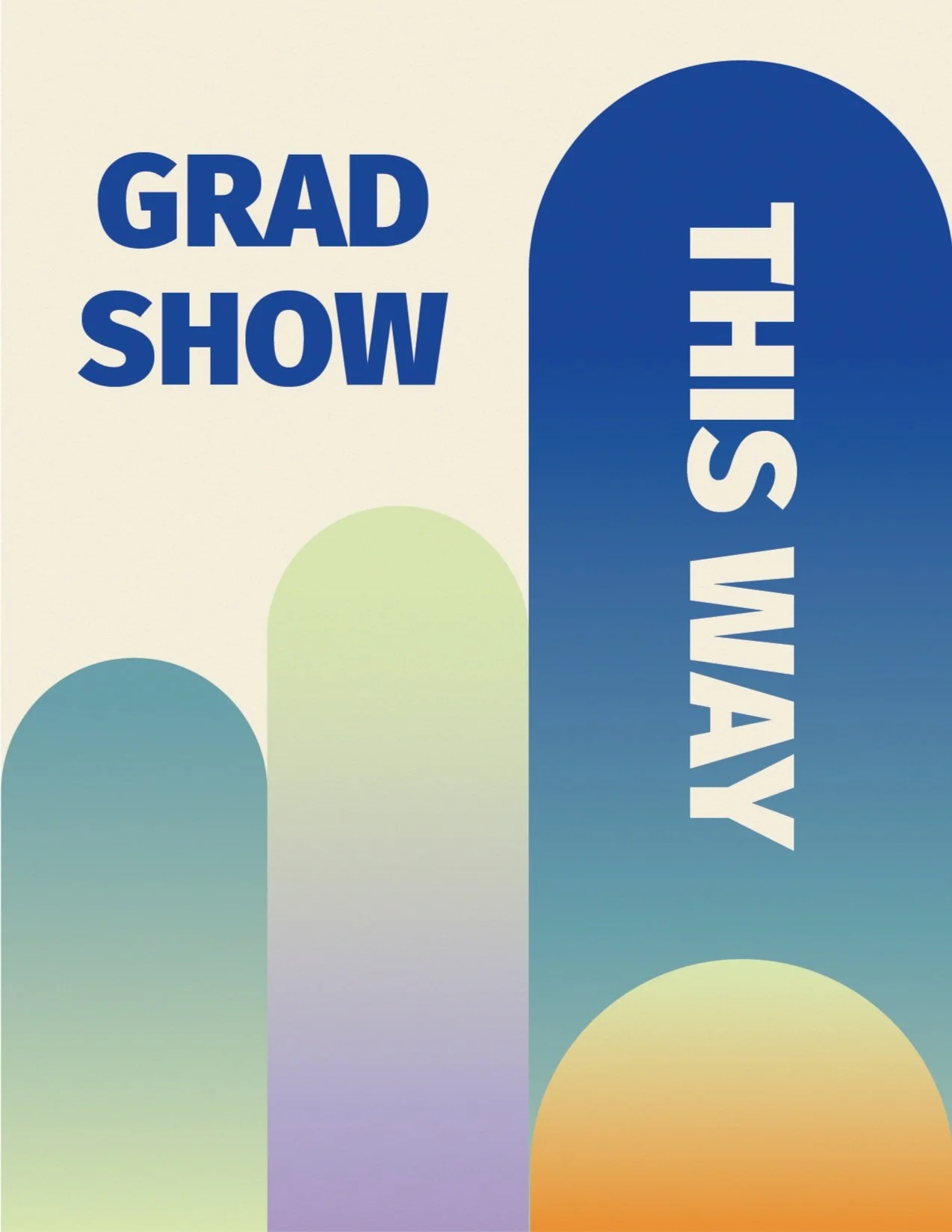
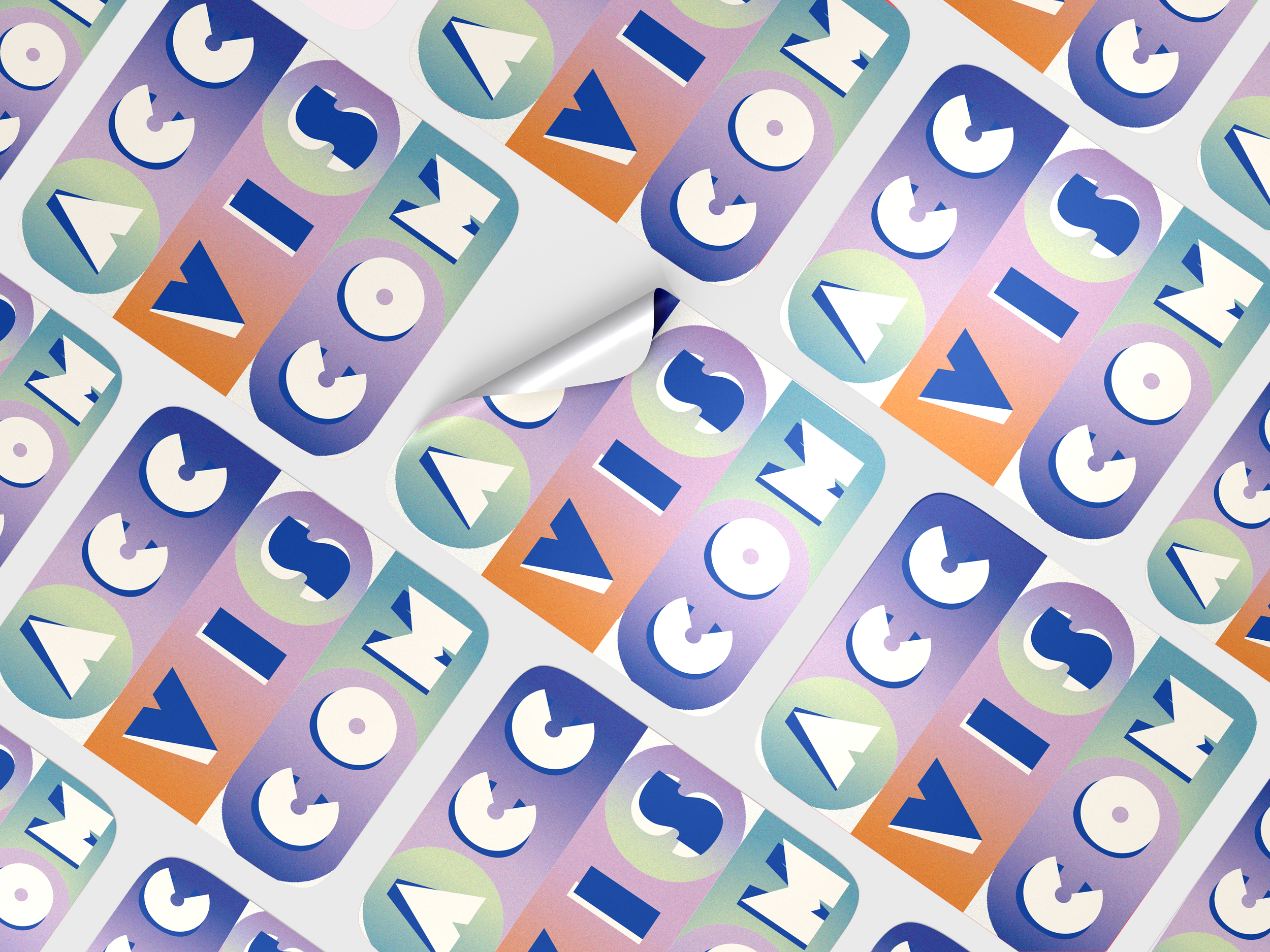
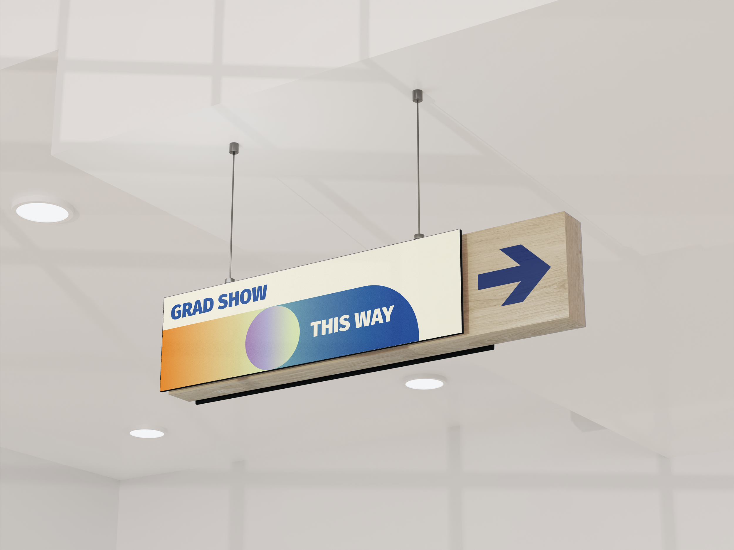
I was tasked with coming up with the entire brand identity of the event as well as the initial event poster, way-finding signage, nametags, and table cards, as well as some stickers as a way to commemorate the event.
In the initial meeting with the department head, Josiah Spence, as well as department advisor, Zoe, it was clear that I would also be representing the UX Designers and Visual Designers, as well as the graduates from my own class in Graphic Design. The final design needed to find a way to visually include everyone’s specialties and degree journeys.
Discovery & Research
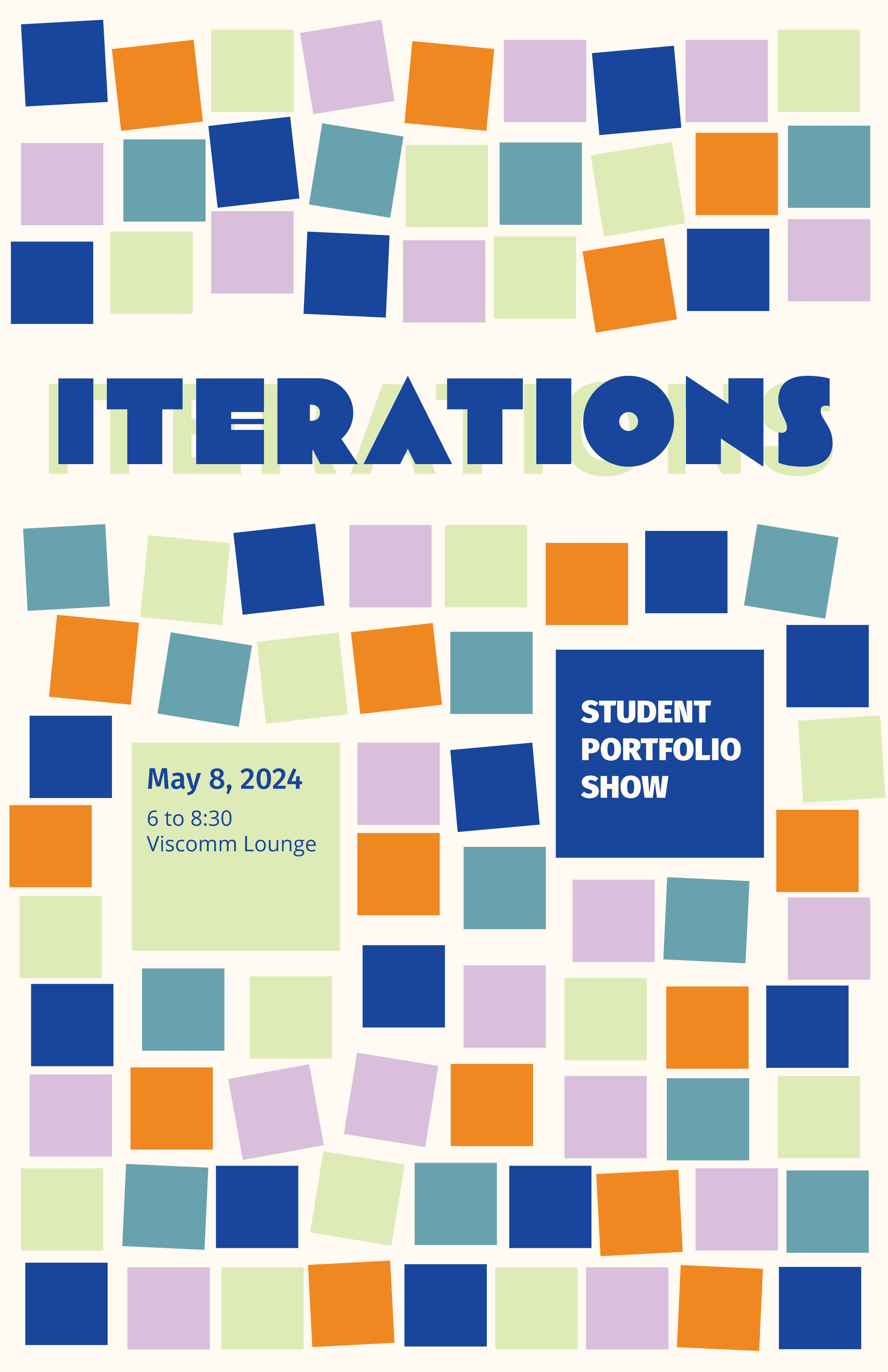
The longest part of this process was deciding on a theme and concept for the initial designs. I spent several hours with my collections of design books and magazines, as well as an ever-growing word map thinking about all the kinds of styles, shapes, colors, and processes that intersect between the graphic and ux design degree pathways. I landed on two main concepts that I built out visually and presented to my project leads: Iterations and Fingerprint
The initial concept with “Iterations” was to commemorate the many versions and drafts of a project we go through to get to the final product, as well as the many versions of ourselves we say hello and goodbye to before we have a degree in hand.
A way to convey this was using shapes to grow and stretch over time as well as text layered over each other in different fonts.
The concept with “Fingerprint” was also fairly similar to Iterations but had more to do with the indelible mark that each individual leaves on their work, this program, and each other in the friendships we build at ACC. I liked the idea of using abstract hands that shape the form of a page and was also inspired by Max Kisman’s abstract figures.
Sketches


Challenge
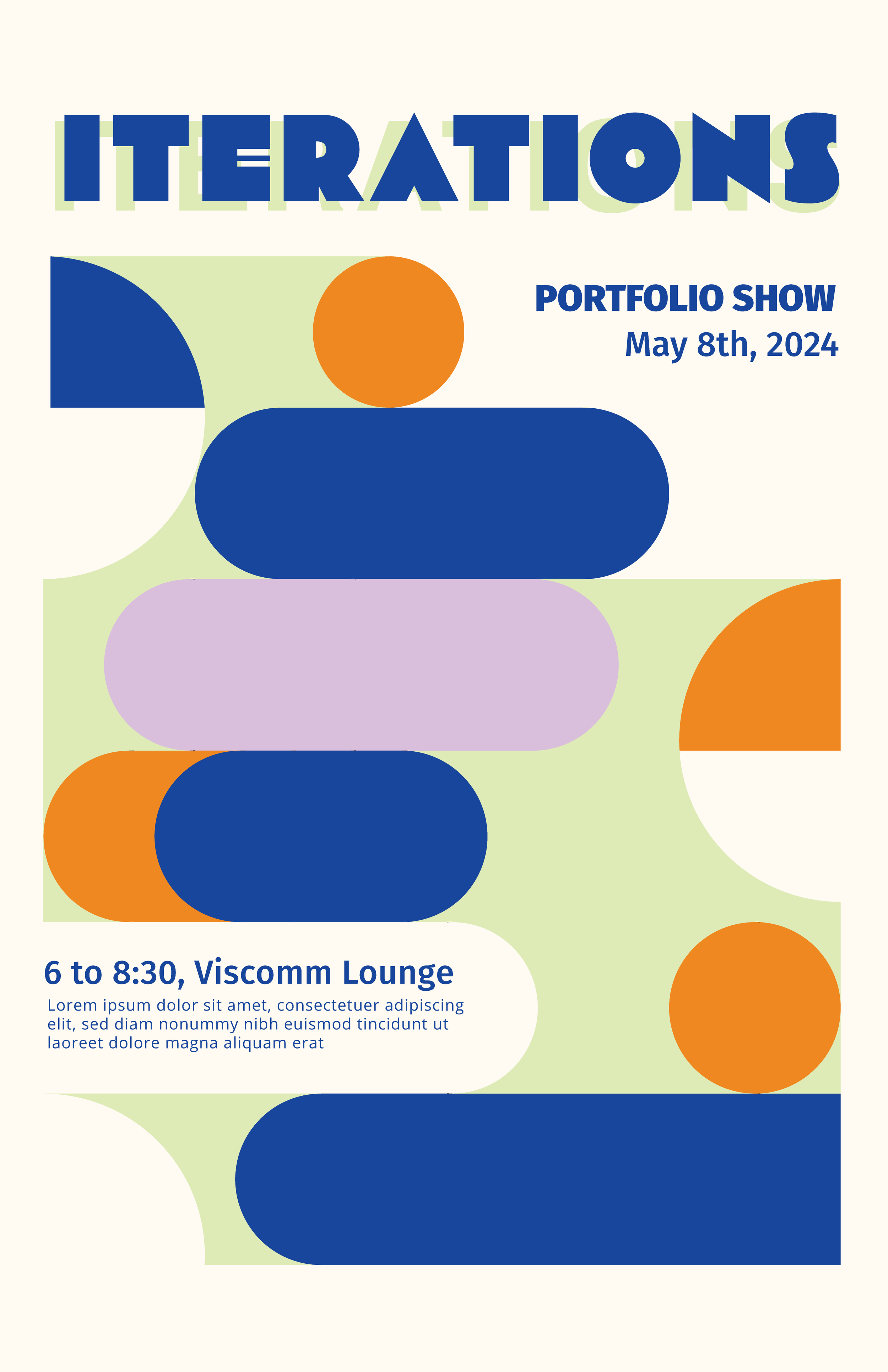
One of the clear challenges with this project was finding shapes and concepts that could be clearly translated across platforms and made into both print and digital collateral. As a team, we decided to move forward with the second concept of Iterations. The idea with this concept was that as designers we are always evolving, always iterating, and as we transform as individuals in this program, so do our skills and work quality. From there it was a matter of refining the flow of information and using the specific shapes and colors to direct the viewer’s attention.
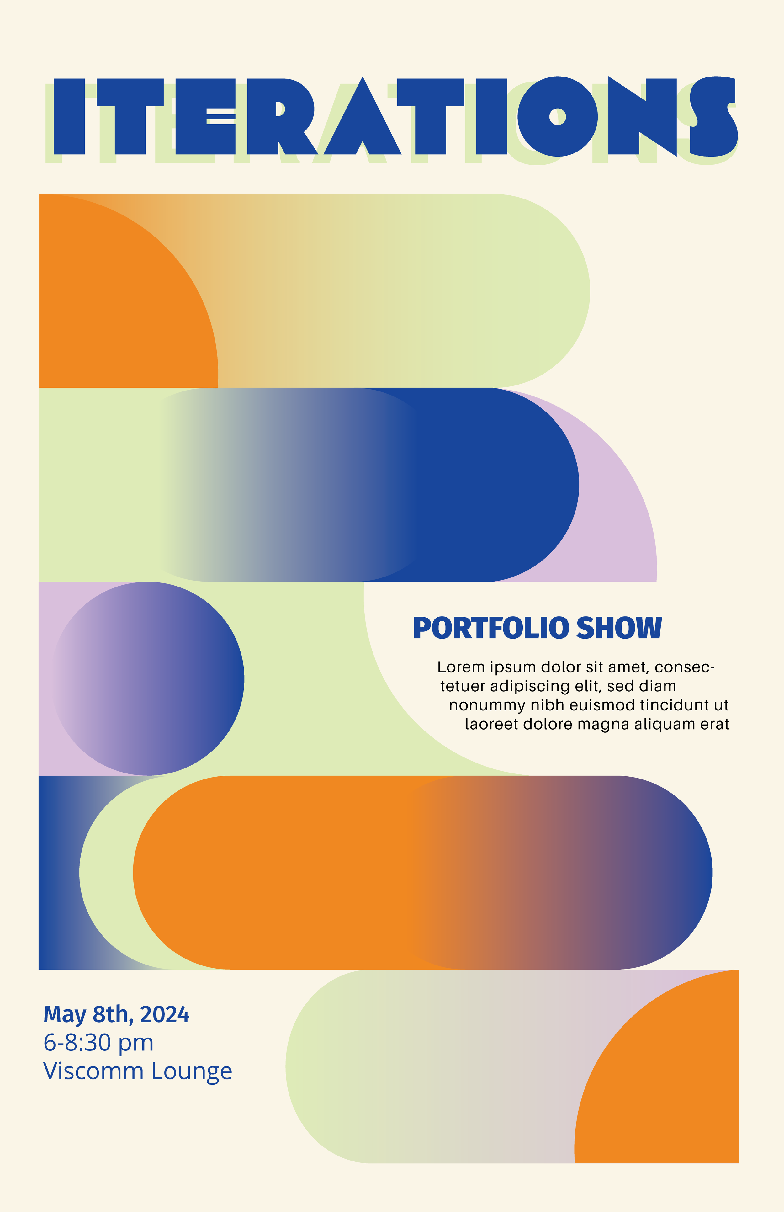
I was very intentional about the directionality of the shapes to create those pockets of white space for the text to grab the readers’ attention. The title font has a separate font as the background to continue this idea of us as students being one thing at the beginning of our degree and something more evolved and confident at the end of it. The colors we landed on are meant to feel both modern and retro at the same time. I noticed in the past two years that many of the students I shared classes with loved different kinds of retro styles and I wanted to share that in some way with the design.


Final Iterations
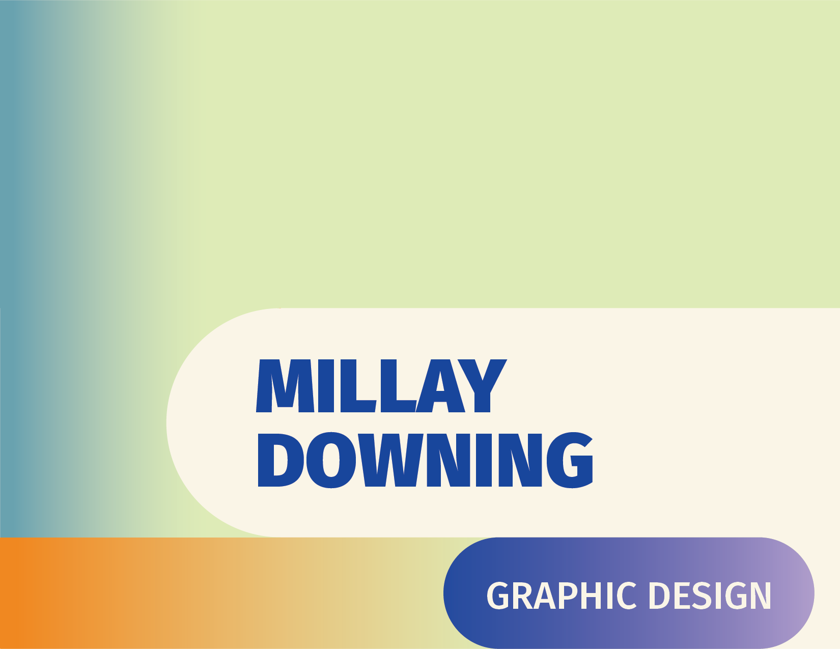
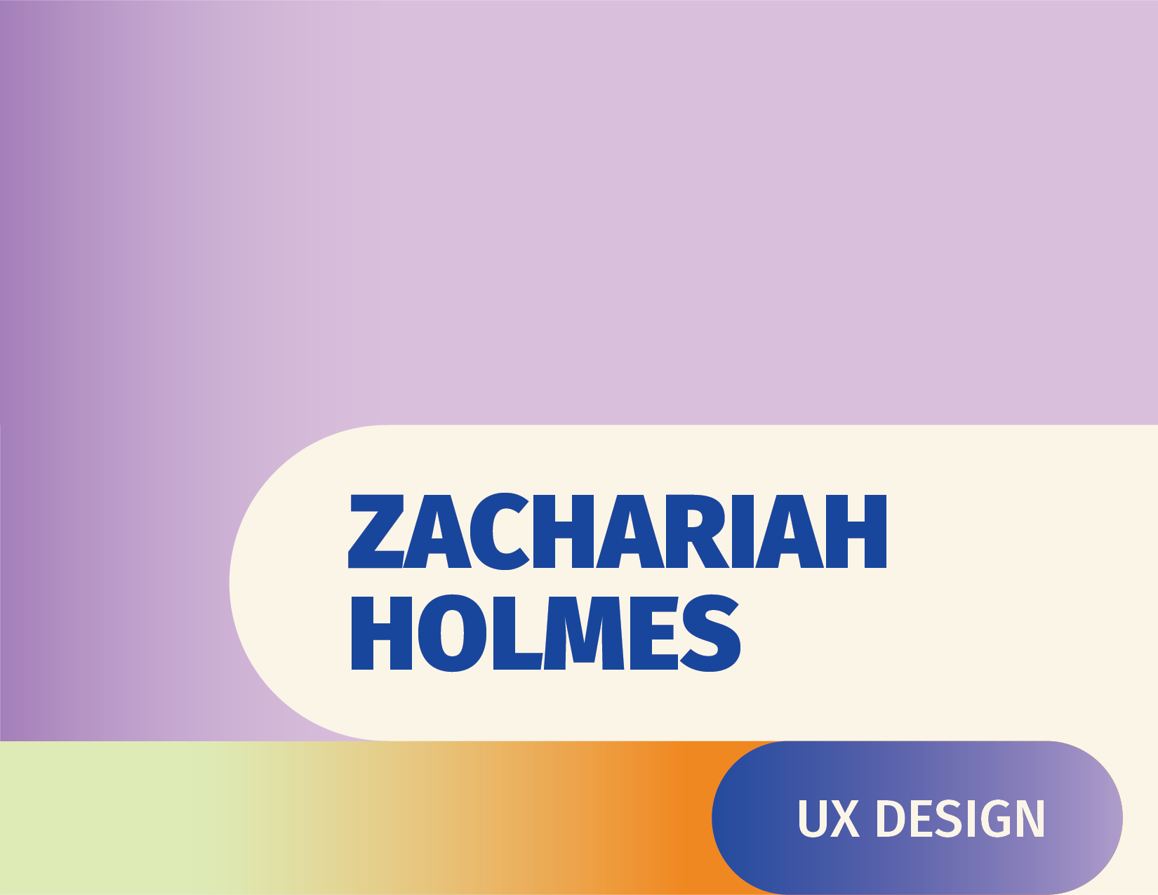
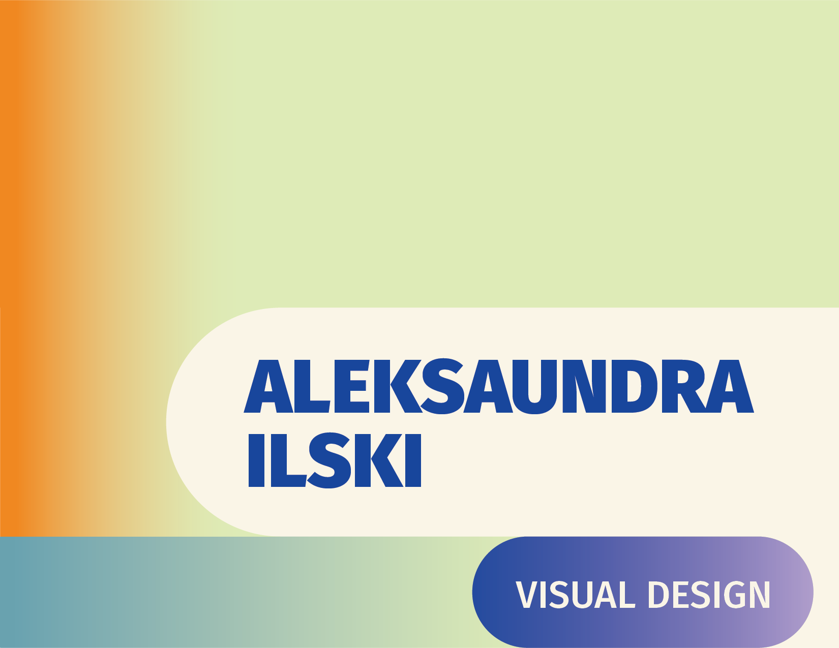
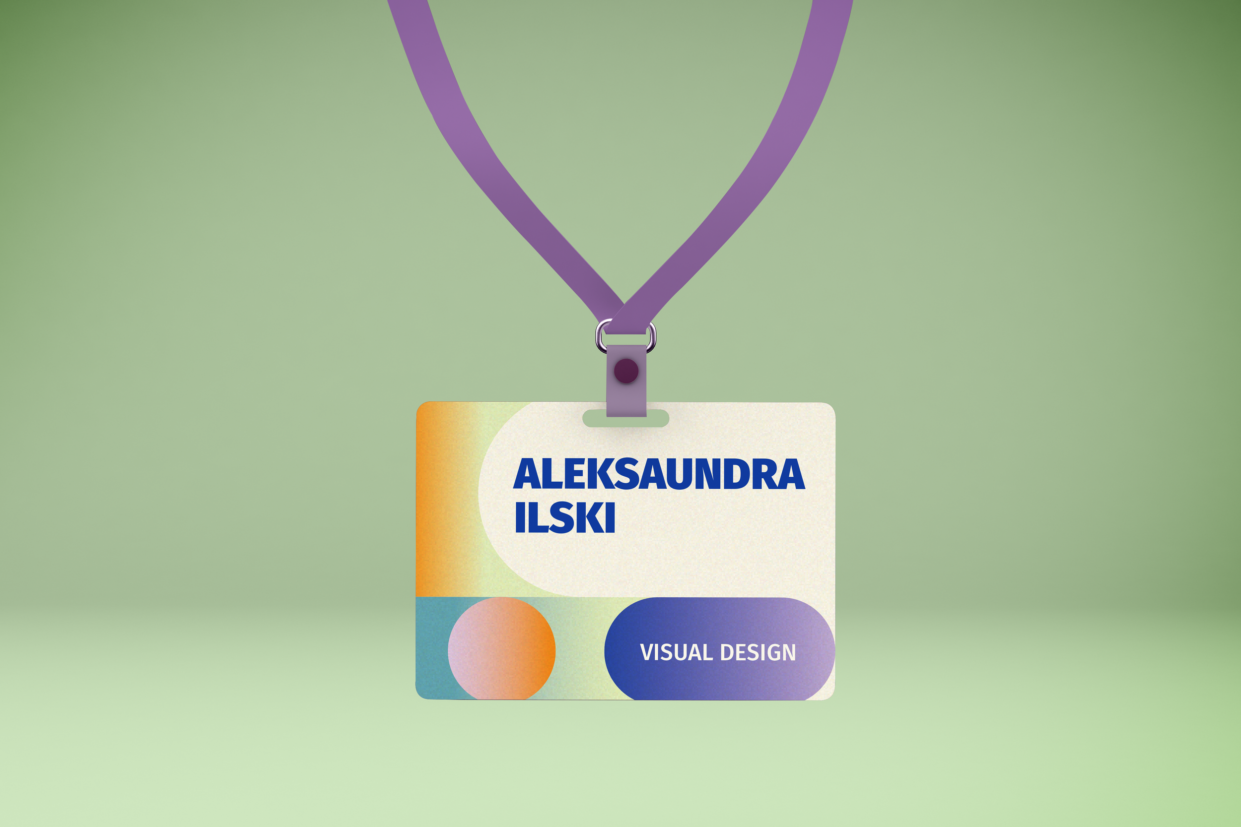
After another rounds of feedback, I made a few intentional revisions to the color gradients to help the text really pop against the background and further direct the flow of attention. I focused mainly on using the dark blue to really add that extra contrast and bounce your attention back to the information.
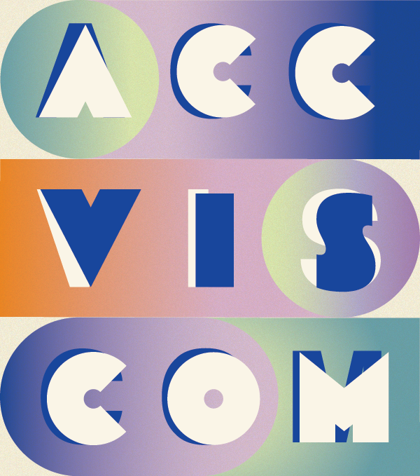
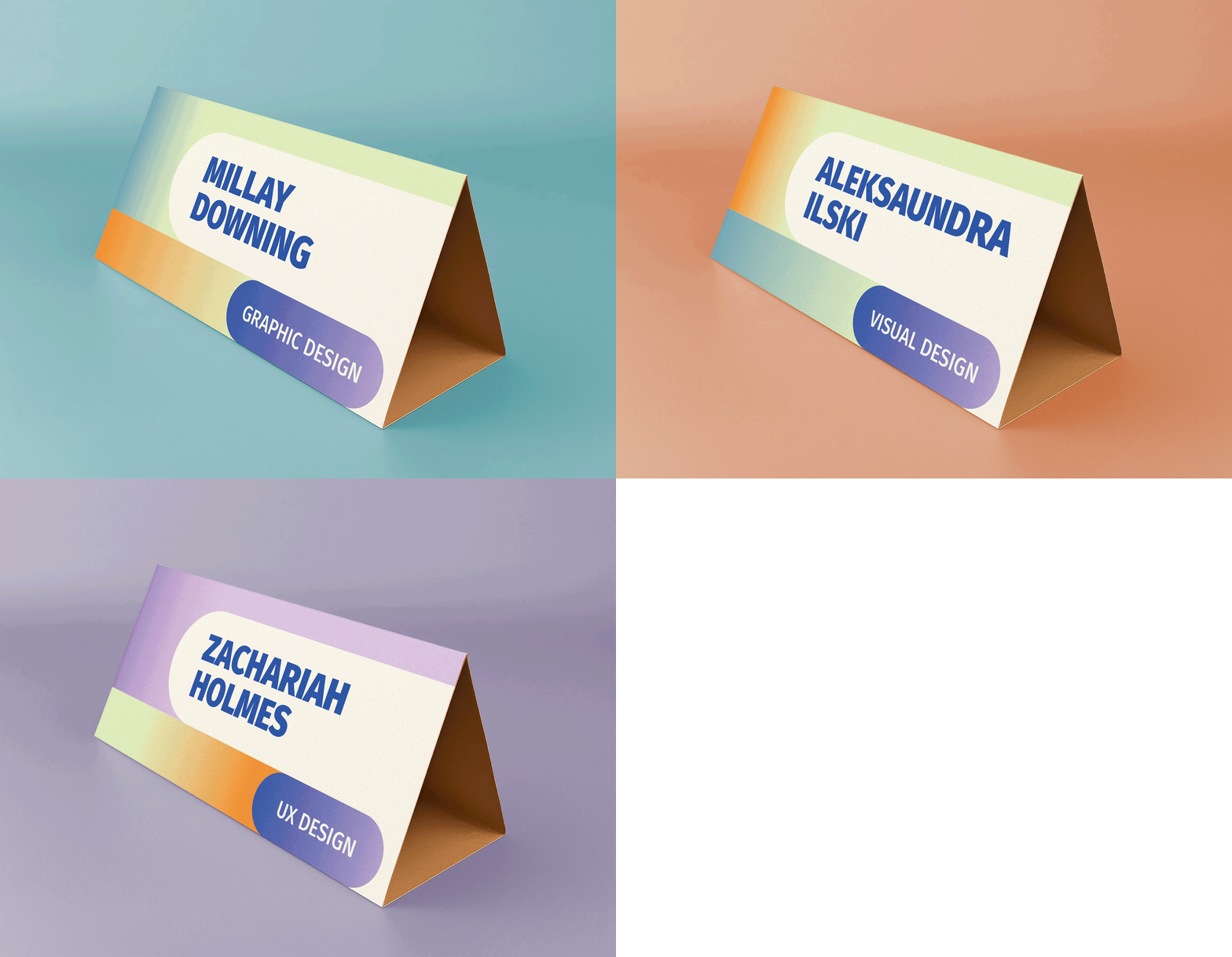
The name tags have subtle differences between each of the degrees and I continued these same gradients with the table cards. It was a subtle choice, but one that took many hours nailing down the perfect combinations of color and gradient placement. I think that the time was certainly well worth all of the effort.
I had the most difficult time finding mockups for the table tents; nothing online fit the dimensions of what I had designed for this project. I recently went to an Adobe event and learned about their new AI tool, Firefly. It only took me about 30 minutes of adjusting prompts to generate a visual mockup that fit perfectly for the table tent dimensions. I went even further with the mockup design by learning about how to generate gifs in Photoshop.







Mockups




Reflection
It was a particular kind of honor and challenge to represent such incredible people and friends of mine for the design of these deliverables. I was equally excited about both of the initial concepts I put together, but I think that the direction we took was exactly what was needed for this year’s Grad Show.
As with most of my projects, I relied heavily on the design process to carry my ideas through to the end. It’s a particular kind of challenge, and one I relish, to take an abstract concept and portray it visually in a way that translates across platforms. It was truly such an honor to be recommended for this project and I felt both called by this concept to bring it to life and so grateful for the feedback from both my department leads and Aleksaundra Ilski, my teammate who brought the designs to life in the conjoining digital products.


