Collioure City Branding
The idea with this project was to find a city and to create a visual identity unique to its particular personality and qualities. I had recently gone to the Metropolitan Museum of Art in New York City to see a gallery show featuring the work of Henri Matisse and Andre Derain as they spent much time together as friends in Collioure in the early 20th Century. The two artists were part of a group that spearheaded the Fauvist art movement in Paris. It’s one of my favorite movements in Art History so I was felt very inspired to create a project that commemorated their friendship and style in the city of Collioure, France.
Discovery & Research
Collioure is a classic Southern coastal town in the South of France with its charming combination of rocky beaches, old stone and plaster town homes and shops, and stunning natural scenery. What Matisse writes about specifically in his time there was the unique quality of golden light in the Summertime that really captured his imagination. In my research of images of the city, I could certainly see in part why he thought so. The brightly painted homes really catch the light in a way that makes the city glow.
Sketches


Challenge
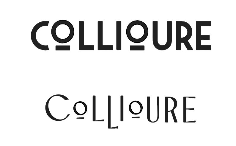
I really wanted to portray this as an ocean town with a lot of interesting history. I also had this vision of the city name being engraved into stone along the many alleyways and wanted to find a logo that would fit well in that context. I searched for font inspiration in the many images of old bakeries and shops in Southern France but found that for this particular project, the weight of that font needed to be consistent and even. After much experimentation, I settled between these two fonts and found which is where I found that the thicker weight held more possibility as a timeless and elegant portrayal of this historic city.
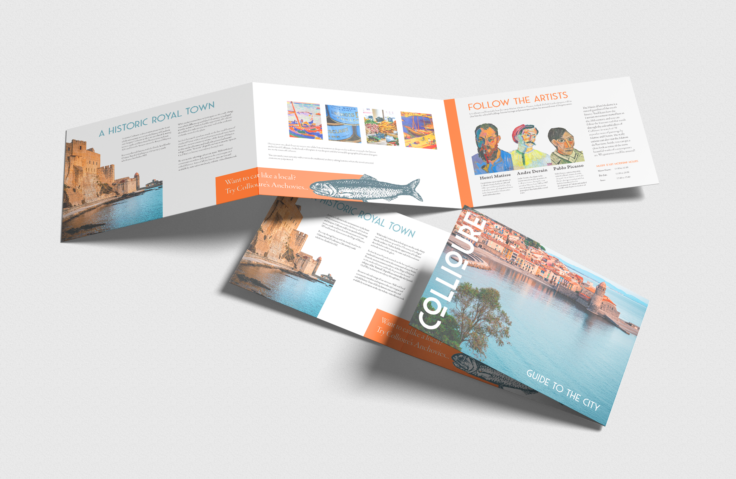
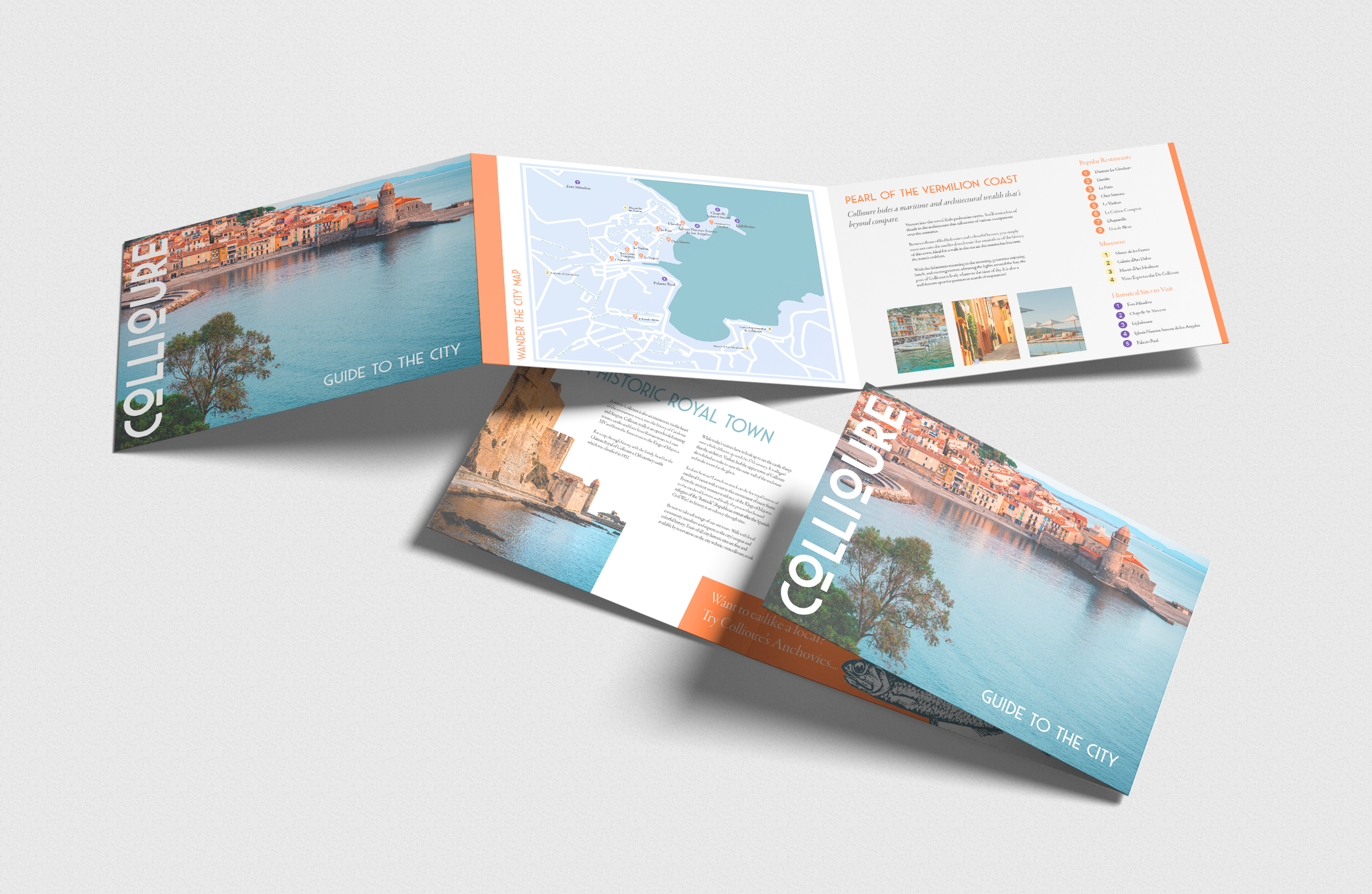
From there I went into designing an example of print collateral you might find at a train station or office of tourism. I focused on locally well-rated shops and restaurants to feature and well as bits of history that I found on the current city website. The colors ranged from the iconic turquoise water of the Mediterranean to the classic Southern periwinkle that I used on the custom map of the city. The orange was my personal favorite as it was inspired by the mention of the quality of light in the summer as well as the brightly painted buildings.


Final Iterations
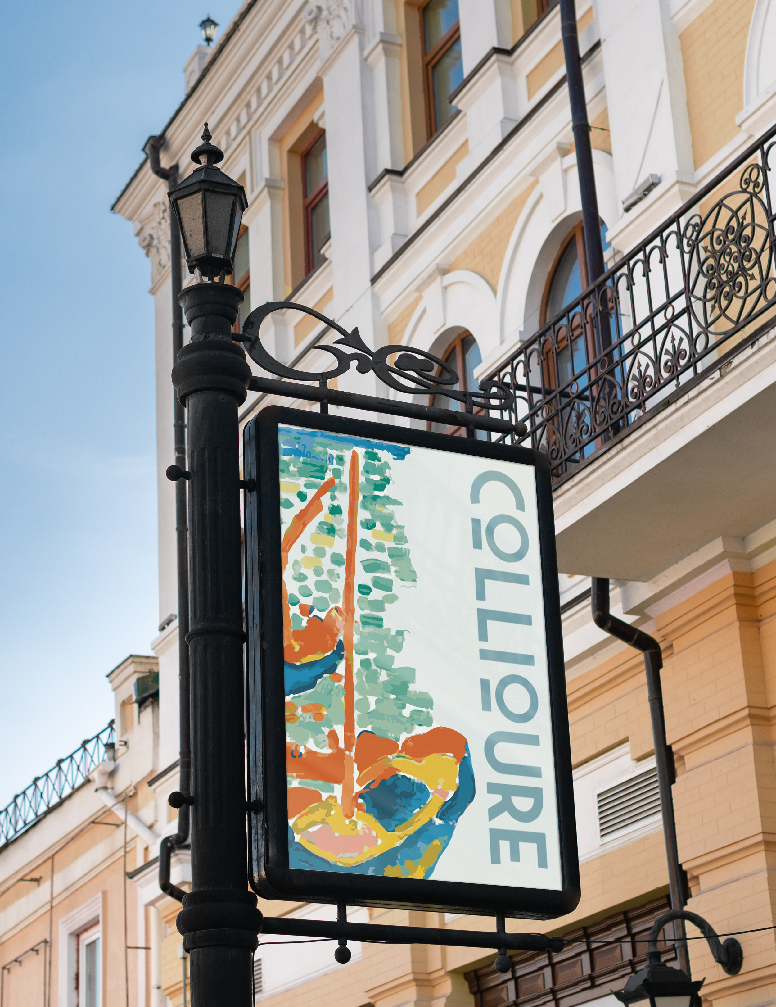
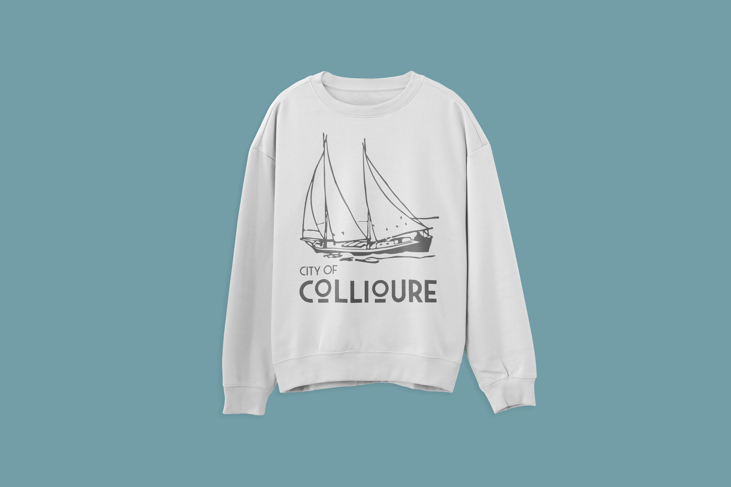
It took a while to get to a point with the pamphlet that I felt satisfied with it. I wanted to be sure that there was enough interesting information on it that it would feel like a valuable souvenir of the city’s history. I spent a while creating and refining the map graphic and using the color coded icons to identify the real locations of the city’s attractions. I also created a website homepage that would pair well with other branded collateral, as well as a souvenir sweatshirt and city signage.
In my early research for this project, I was looking for a city name font that would feel timeless and believable if it were engraved on a stone in one of the city’s alleyways. Once again, it was impossible to find a mockup that fit the vision I had in my mind for this. I was able to use my new understanding of Adobe’s Firefly AI program and prompt the tool until it generated a believable image I could use for the city logo. Placing the final effects on the layers in Photoshop felt like the ending of the most satisfying novel. From beginning to end, the design perfectly fit what I had in mind for this project and the image was exactly what I’d envisioned for it.
The final piece of this project was creating a city website and using imagery and color to fit the visual identity of the city itself. It took a lot of refining, and this was also my first project using Figma, but I feel quite proud of how this turned out and what I learned.
Mockups


Reflection
For one, this project fueled my desire to visit Southern France at the earliest opportunity, and secondly, it was really fun to imbue my love of art history and Fauvism into these designs. I knew that I didn’t want color to completely take over the project, but I feel that I still offered enough of a tribute to the city’s artistic history while also centering the context of the city as being very elegant and coastal.
“When typography is on point, words become images.”
— Shawn Lukas
Copy for this project belongs to:


