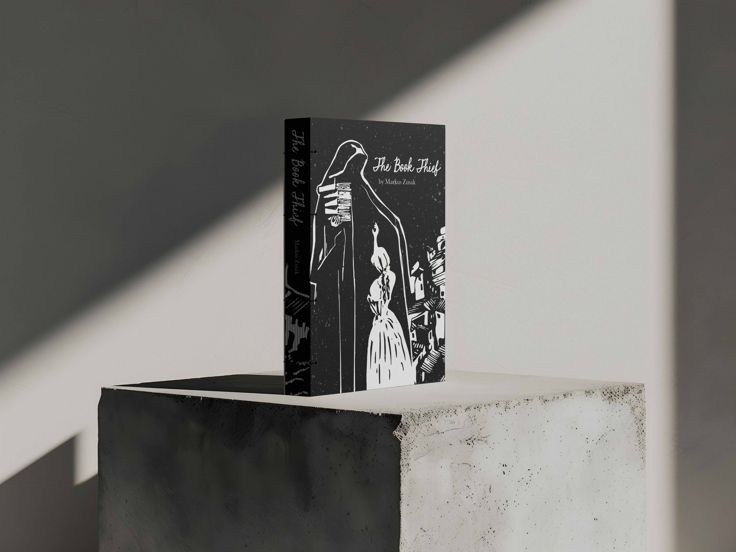
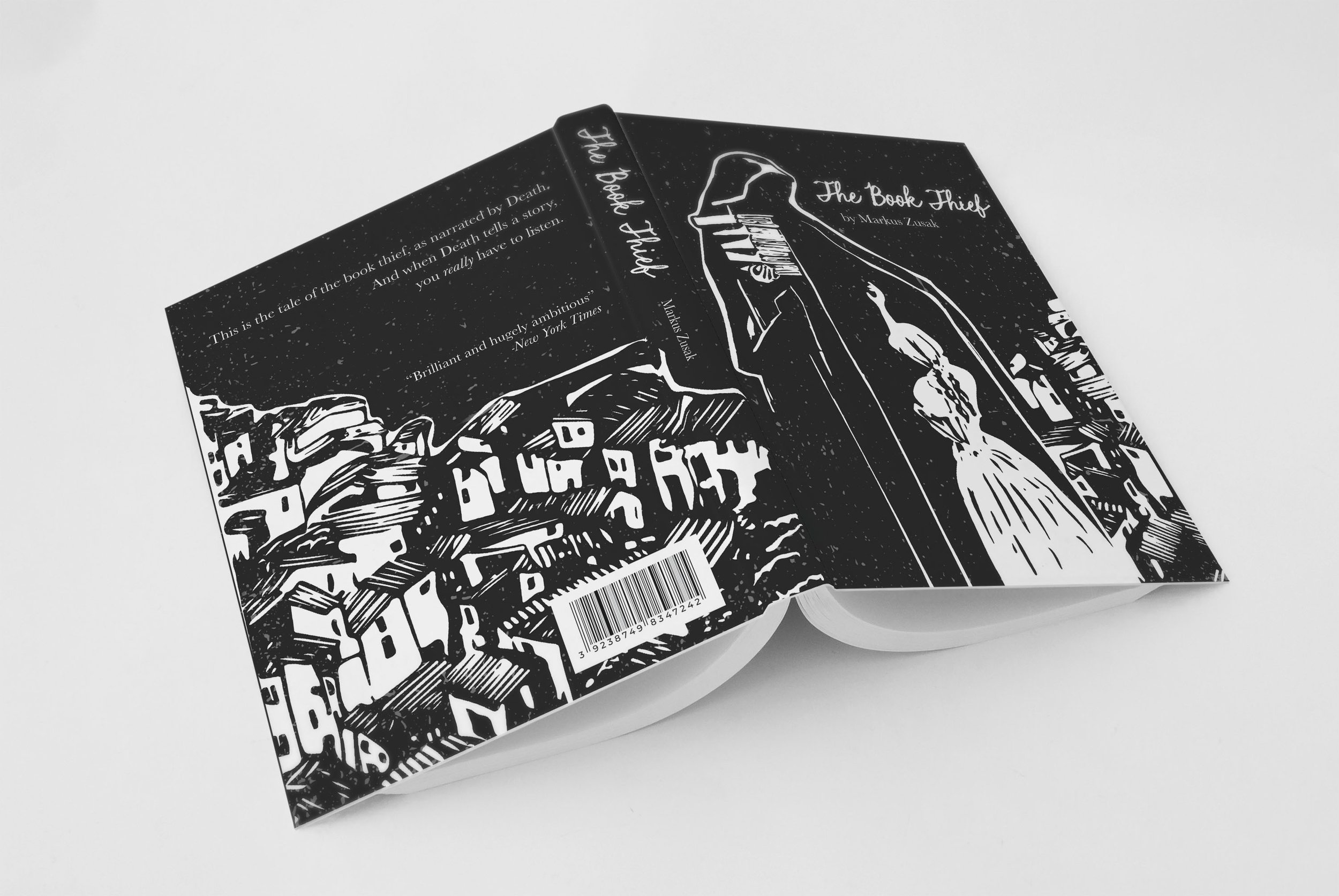
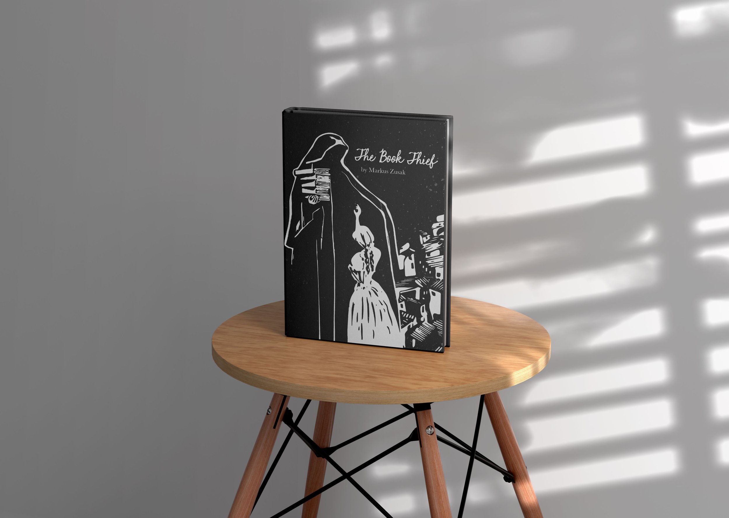
With this book cover, I wanted to design something specifically for the teens that grew up seeing the world through the magic of literature and who matured into stories like this one. The Book Thief is by no means a story with a happy ending, but I wanted to show that while there is an element of great horror to this story, there is also a strong thread of innocence and hope. To capture this, I looked for visual inspiration with old children’s books printed in the Early 20th Century. I wanted the style to feel very illustrative and rough cut, as if printed with a linocut block. Liesel, the main character, is a very young girl when the tragic story arcs occur to her and part of the narrative is about her coming to understand how to protect her own innocence while it is being taken away by the cruelty of others. I was drawn to a very black and white palette because the dynamics of good and evil are very clear in this novel and I wanted to also paint the relationship between Liesel and the narrator, who is Death himself
The Book Thief Dust Cover
Discovery
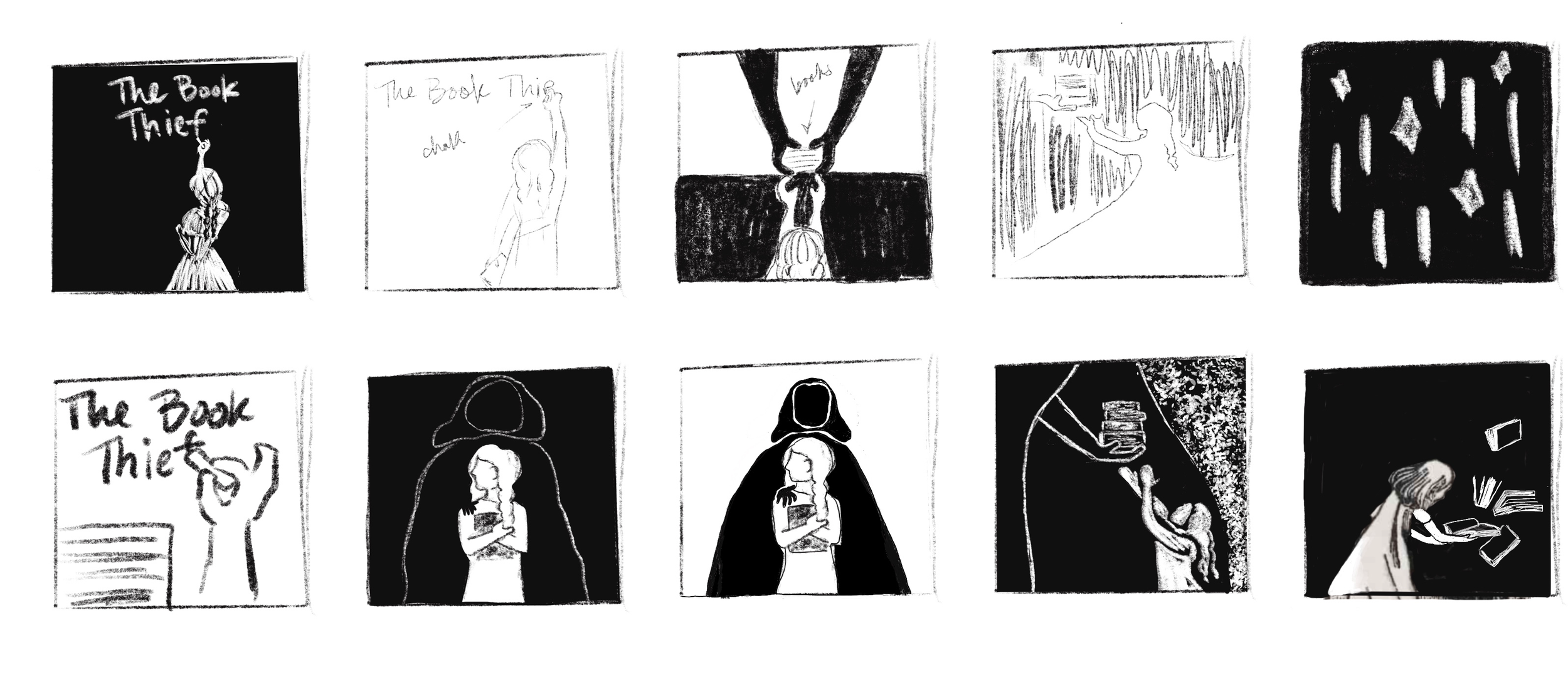
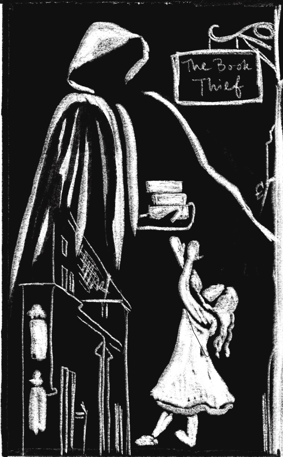
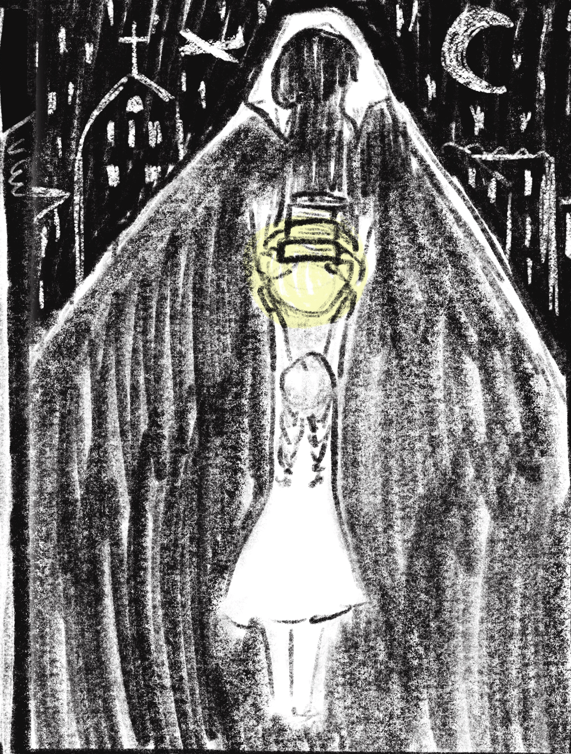
I was drawn to a very black and white palette both because of the theme of good vs evil but also because of the idea that many of the things that are taken from Liesel, happen at night, when Death comes out to collect. It felt important to me that the cover would appeal to the youngest reader as well as the oldest. I chose the woodblock print texture as something that would visually call back to an older age of printing. I wanted it to feel both illustrative and convey that sense of seriousness about the story from the get-go. The very whimsical but simple figures and shapes could both excite the imagination of a YA reader, and be something beautiful that someone could display on their shelves for a long time and not lose its sense of beauty. I think that I achieved that sense of ominous visual impact with the stark contrast and simplistic figures.
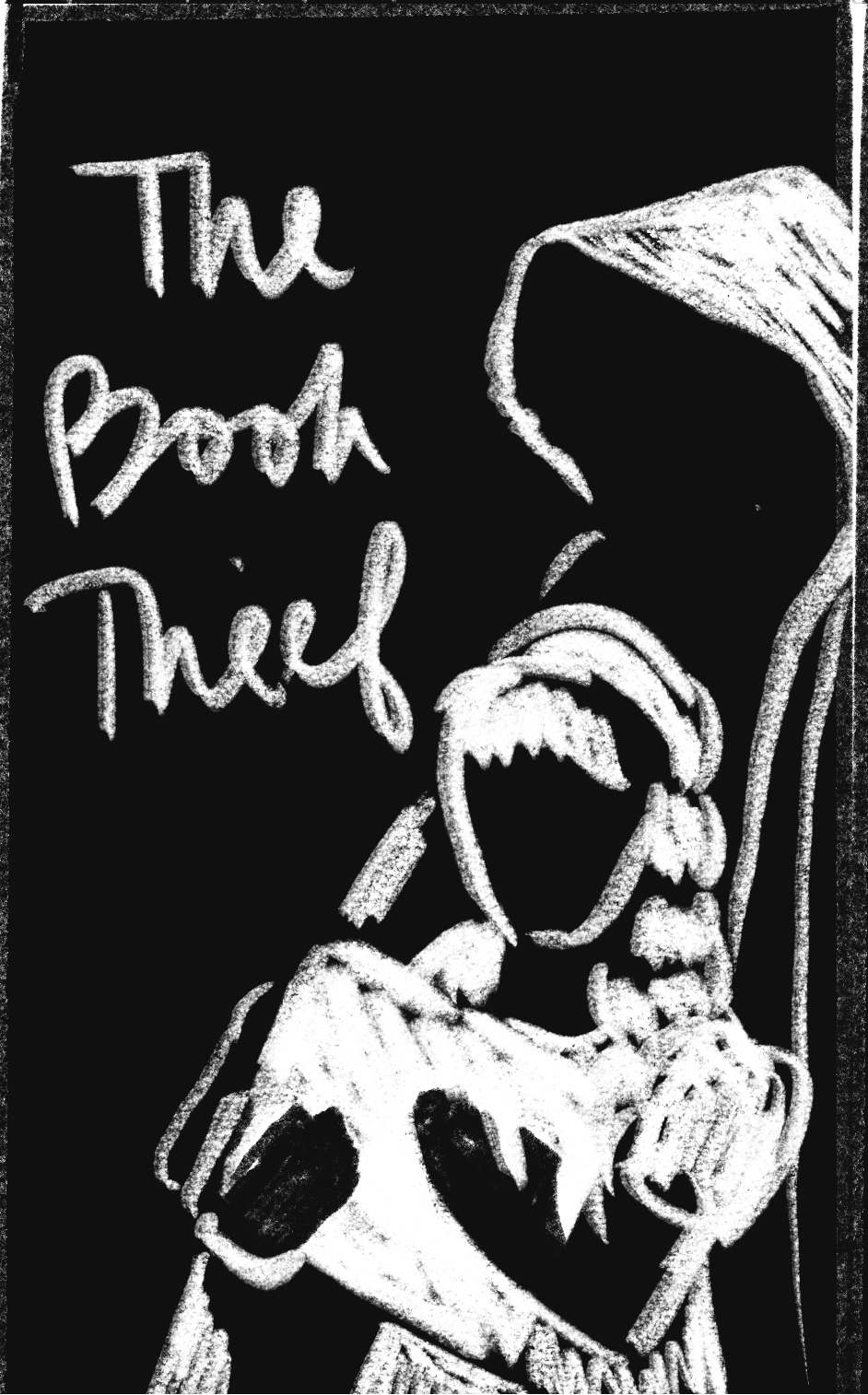
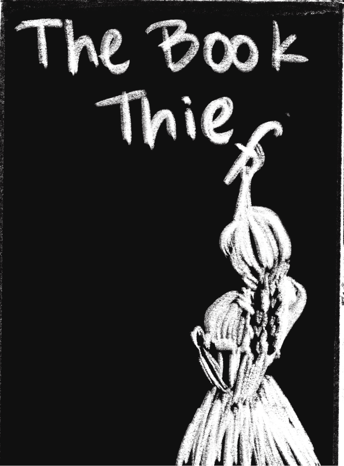
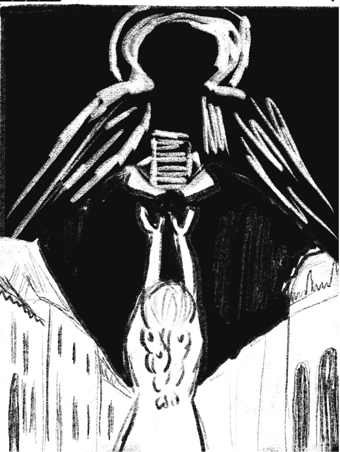
Sketches
Challenge
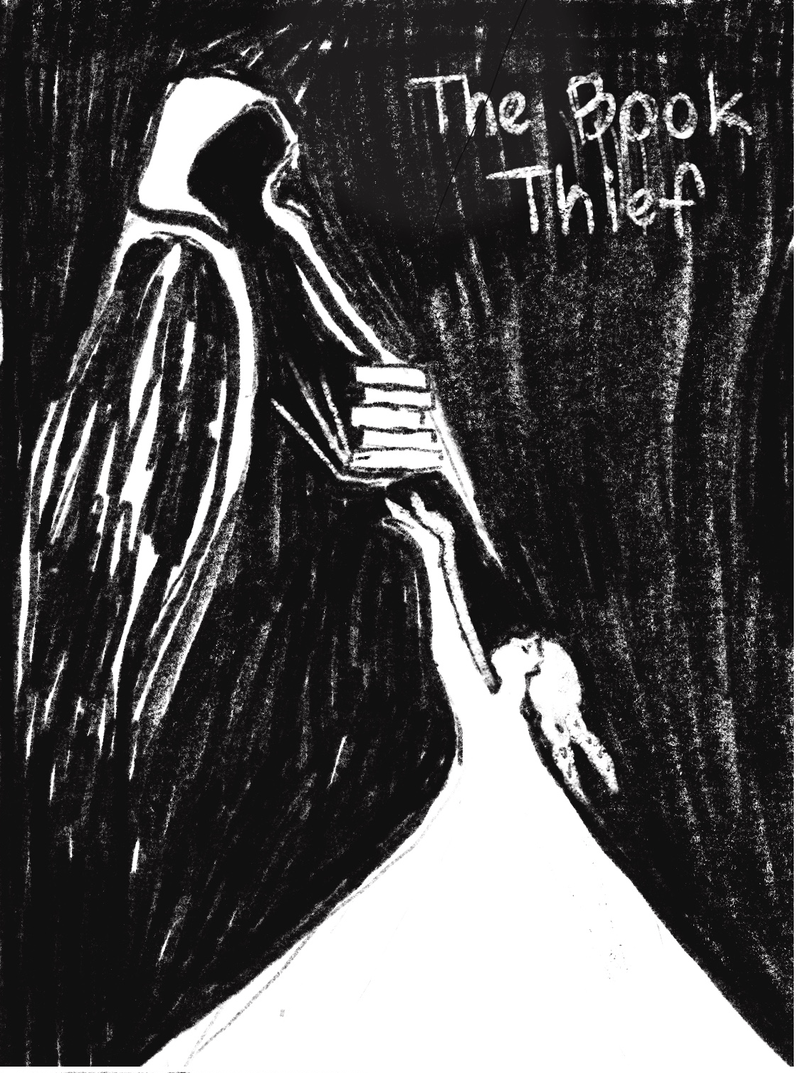
Finding the right balance of sketchiness and blank space was very tricky. It took many hours of sketching, vectorizing in illustrator and tweaking little lines over and over until I found the perfect visual balance. The other big challenge was finding a font that felt sketchy and tied well to the narrative of the book. For this I settled on Visual Impact which was very chalky and cursive. I chose the title font to portray the important moment in the book where Liesel learns how to write using chalk. Her ability to use words and story to understand the world around her is another pivotal moment in the book. The font has that very chalky texture but was also very neat and readable. The body text I chose also to be very classic and readable as well.


Final Iteration
My final drafts came down to two versions of Liesel on front cover, one being simple, and the other showing more of her form. I chose the latter version because while Death is the narrator, he is also a fairly abstract character. I wanted Liesel to look and feel real. The second version conveyed that idea a little better.
Mockups

Reflection
This project was a big lesson in trusting myself in the process of generating interesting ideas. There came a point when I felt like my original ideas were too simplistic. Should I have added color or gone in a different direction? When I really leaned into trusting the work I’d already done at the start, in terms of the layouts I’d created while sketching, the visual problems that were stumping me immediately resolved and were replaced with newfound excitement. I really began to trust the design process and trust myself.


