Designer Highlight: Violaine et Jeremy
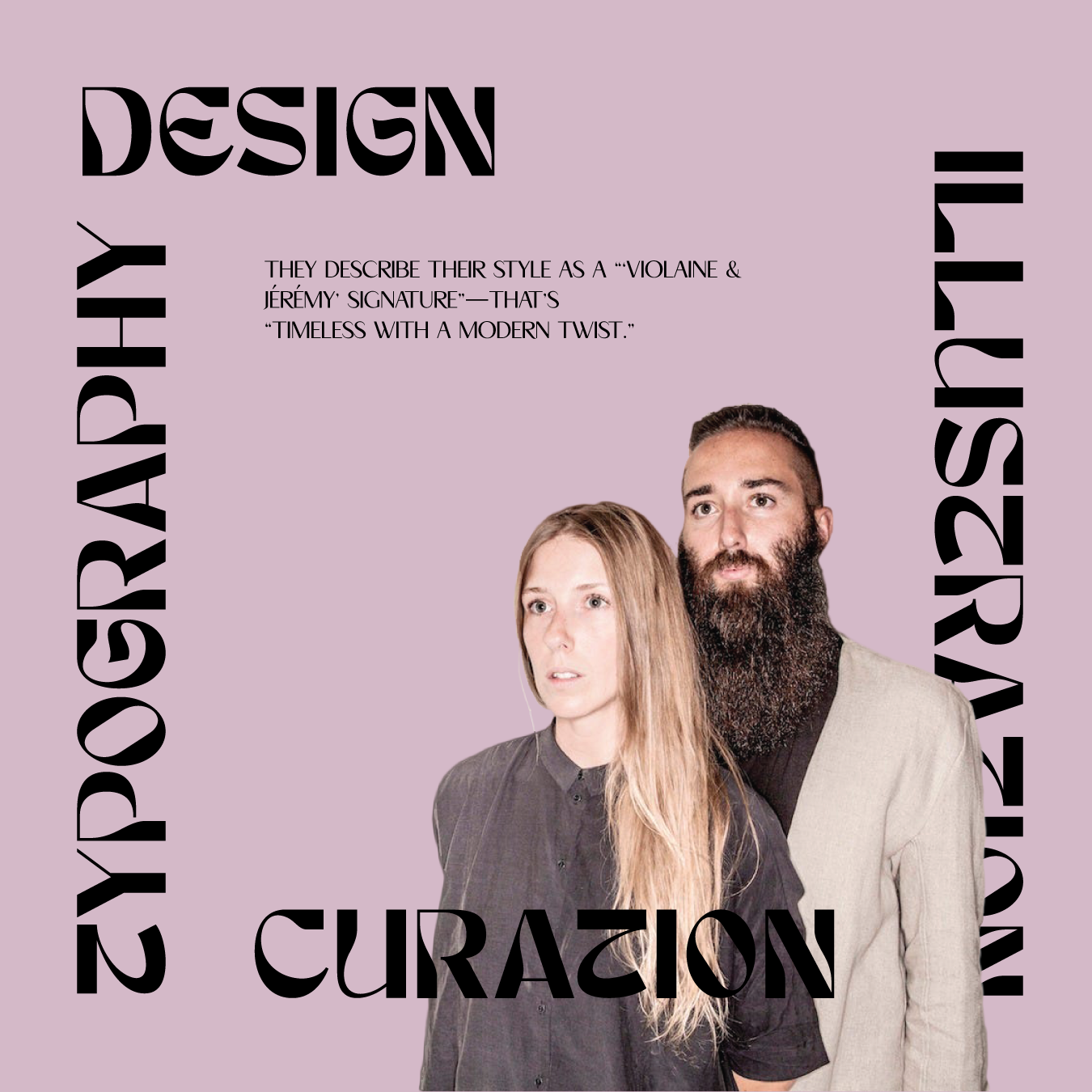
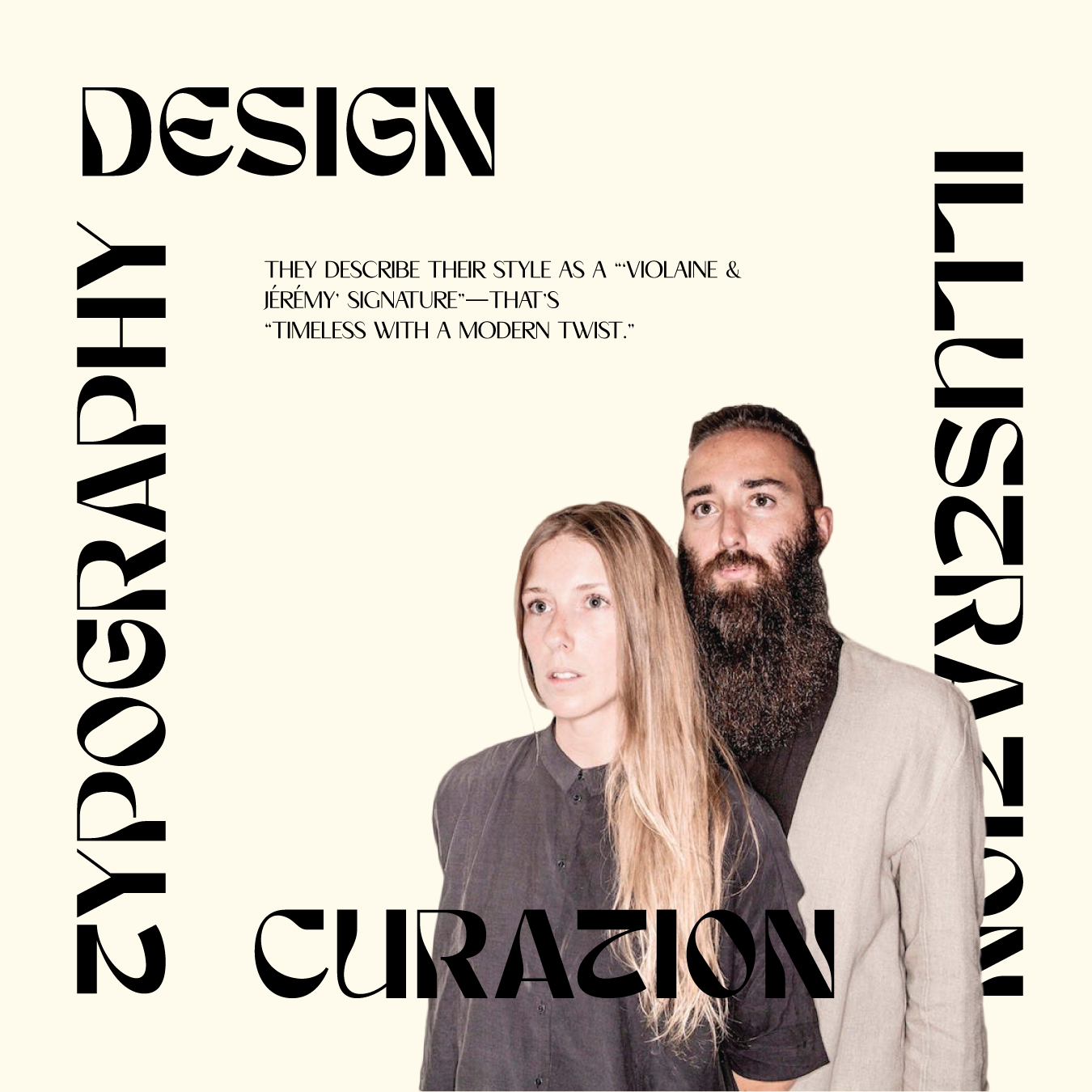
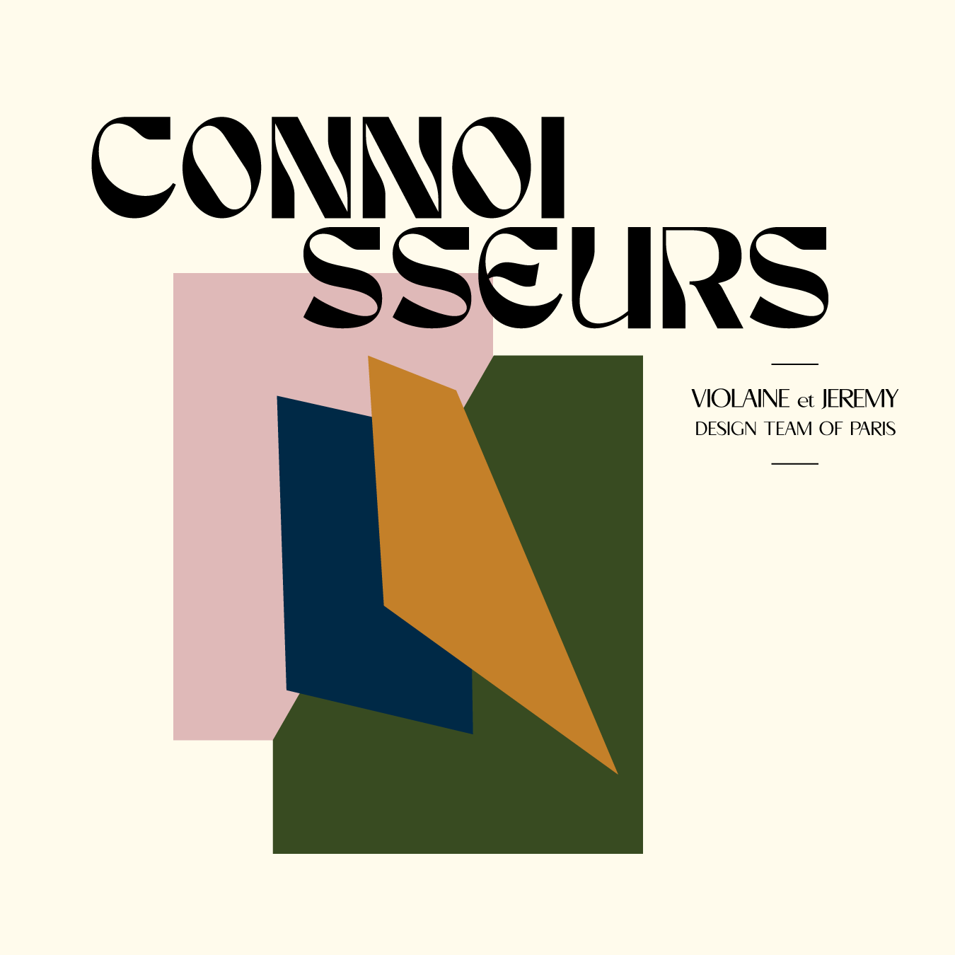
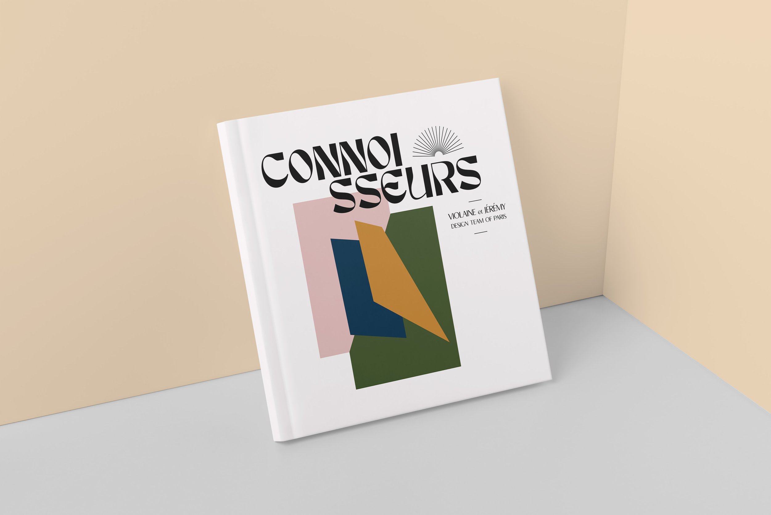
When I was asked to create a booklet highlighting a designer or design team that inspires my own sense of style, I immediately thought of the font foundry and work of my favorite design team from Paris, Violaine et Jeremy. This husband and wife duo use their masterful sense of color and illustration, with a touch of art nouveau flair to craft the most remarkable designs and products for their clients. The following images and booklet spreads represent my own tribute to their incredible work.
Discovery
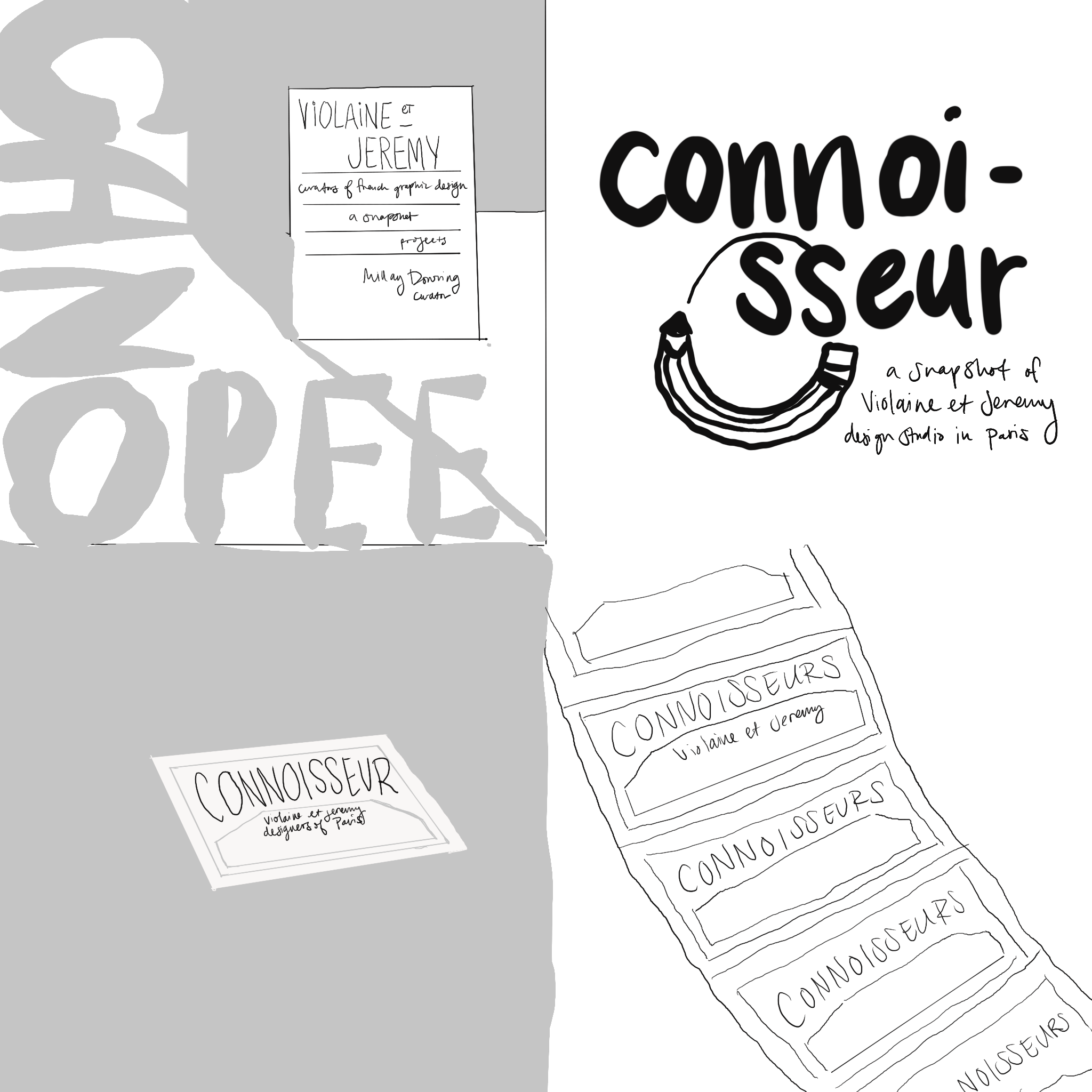
For this concept, I pulled inspiration from cool-toned moody colors, chunky font faces with round edges, and visual elements that had a muted post modern aesthetic. After extensive review of Violaine and Jeremy’s work and style, I tried to recreate their design voice with my own touch of visual hierarchy and color.
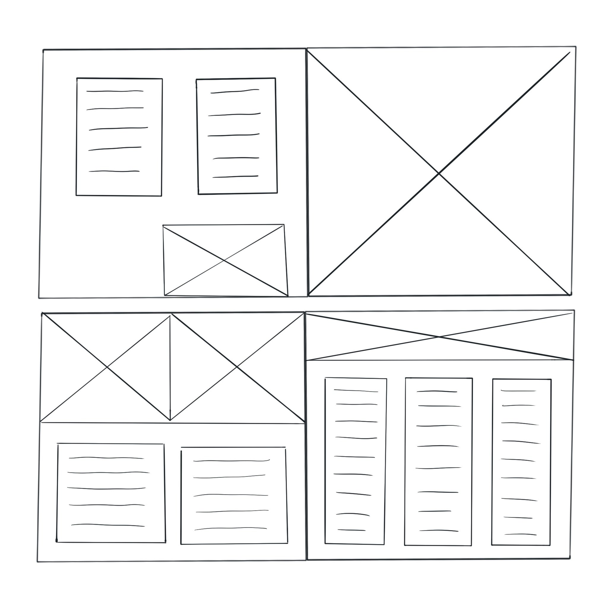
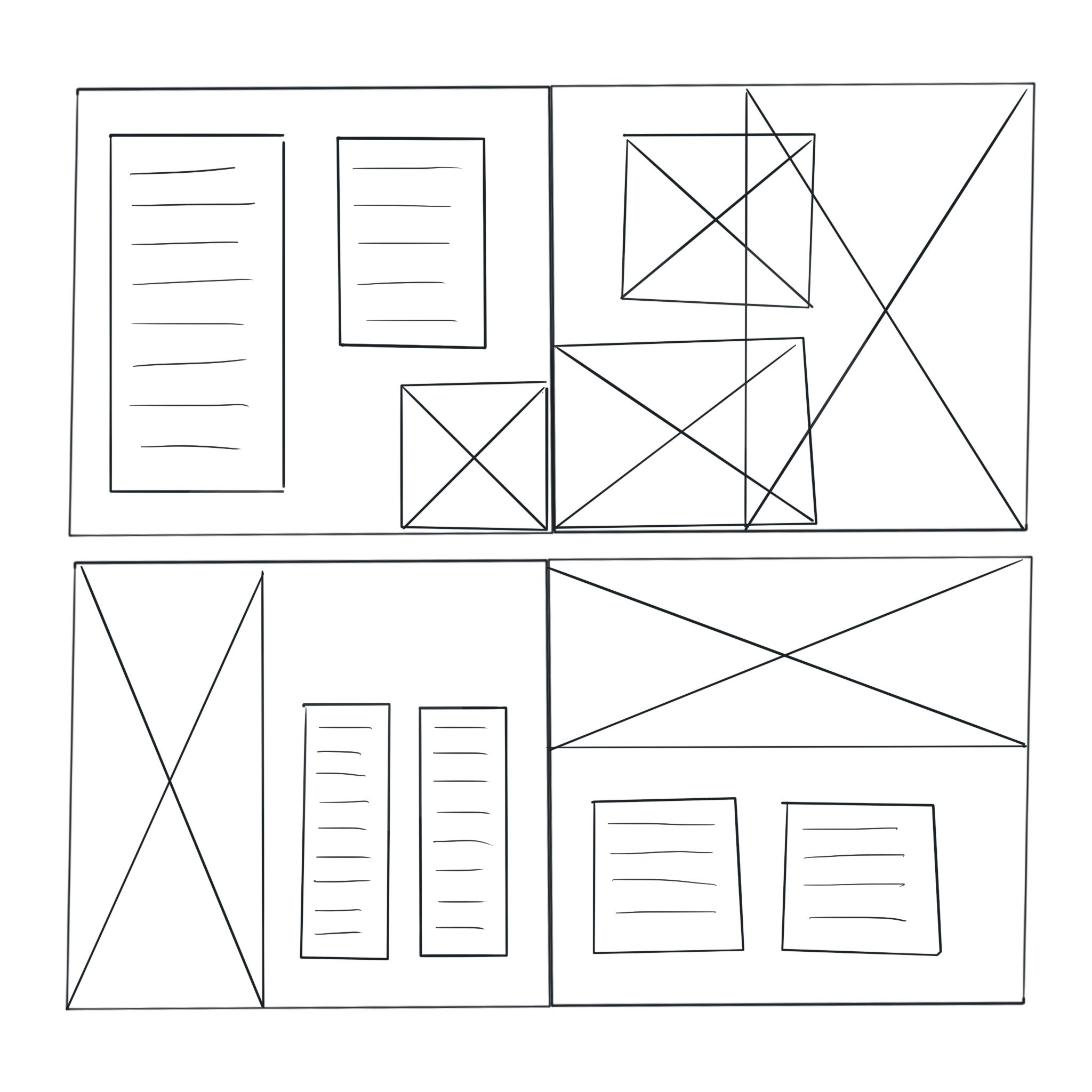
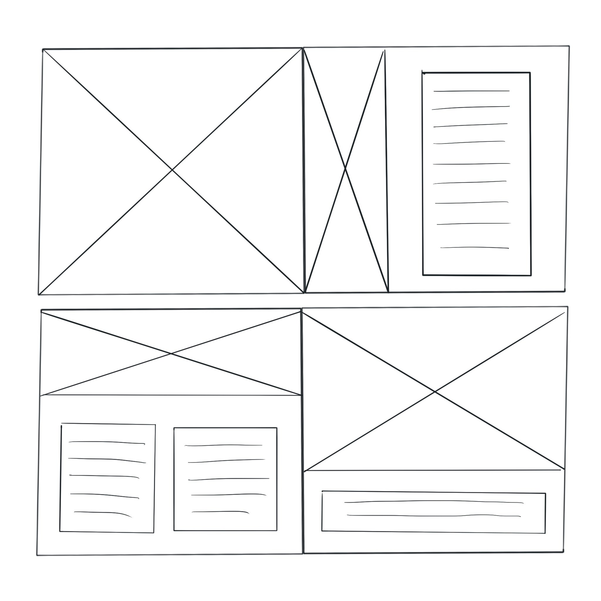
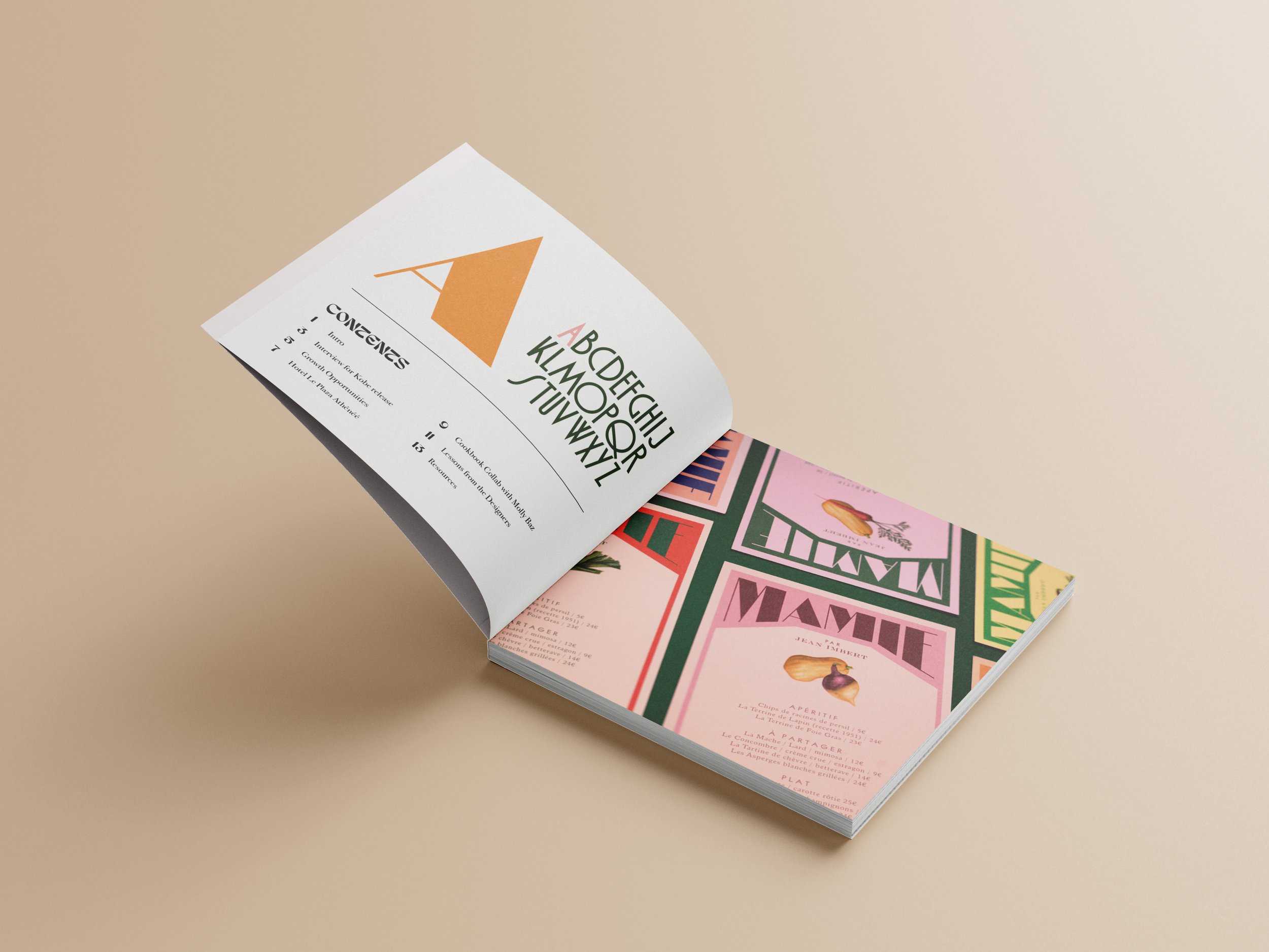
For the building of the page layouts, I started with cutout paper squares that represented different image and text combinations before creating the same thing in my digital sketches. I made components that I combined in different ways until I found layouts that felt distinct enough from each other that each of the designer’s projects could be highlighted for their own distinctness while also having a similar aesthetic that worked together
Sketches

Challenge
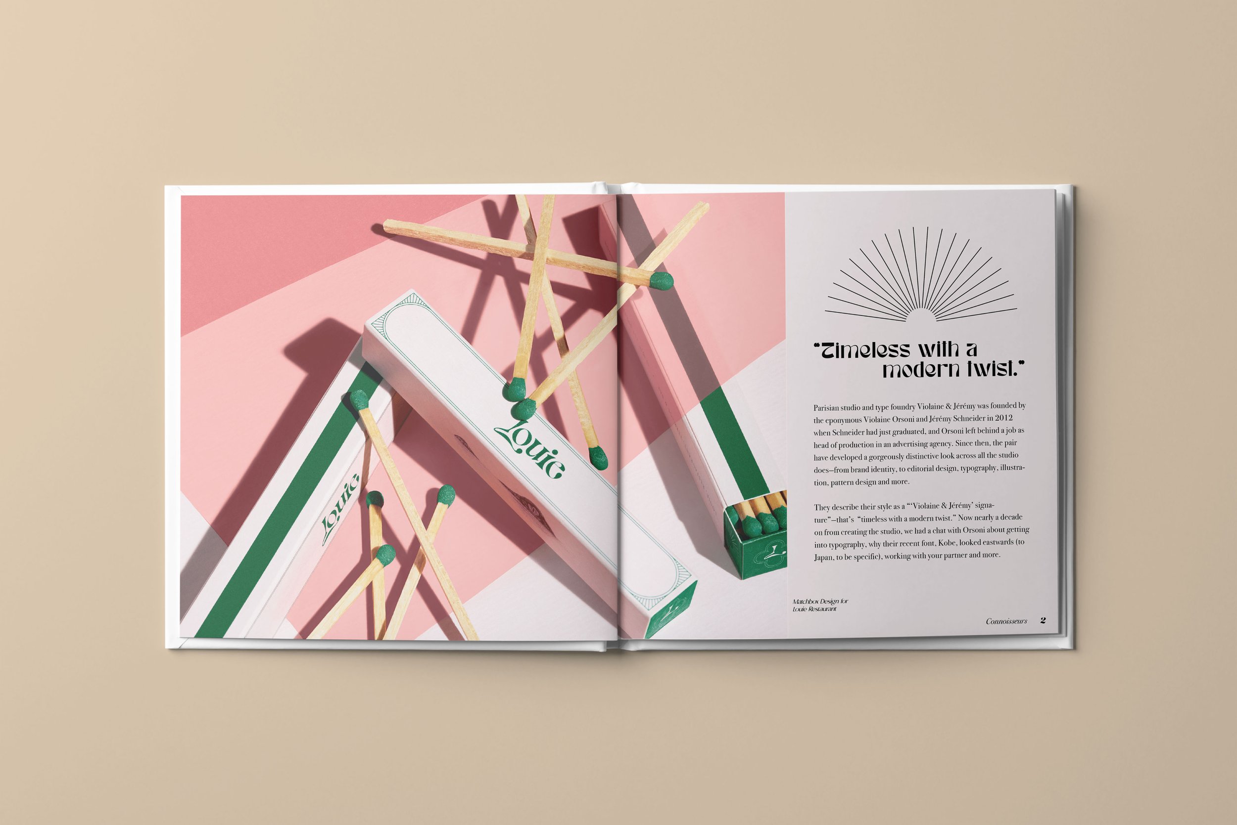
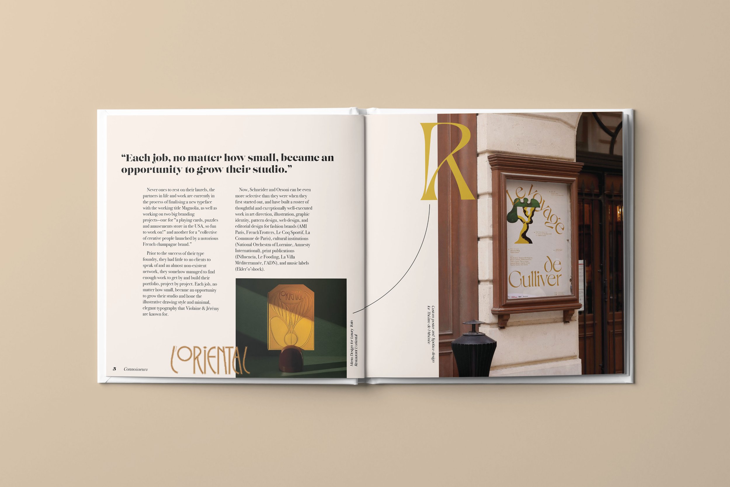
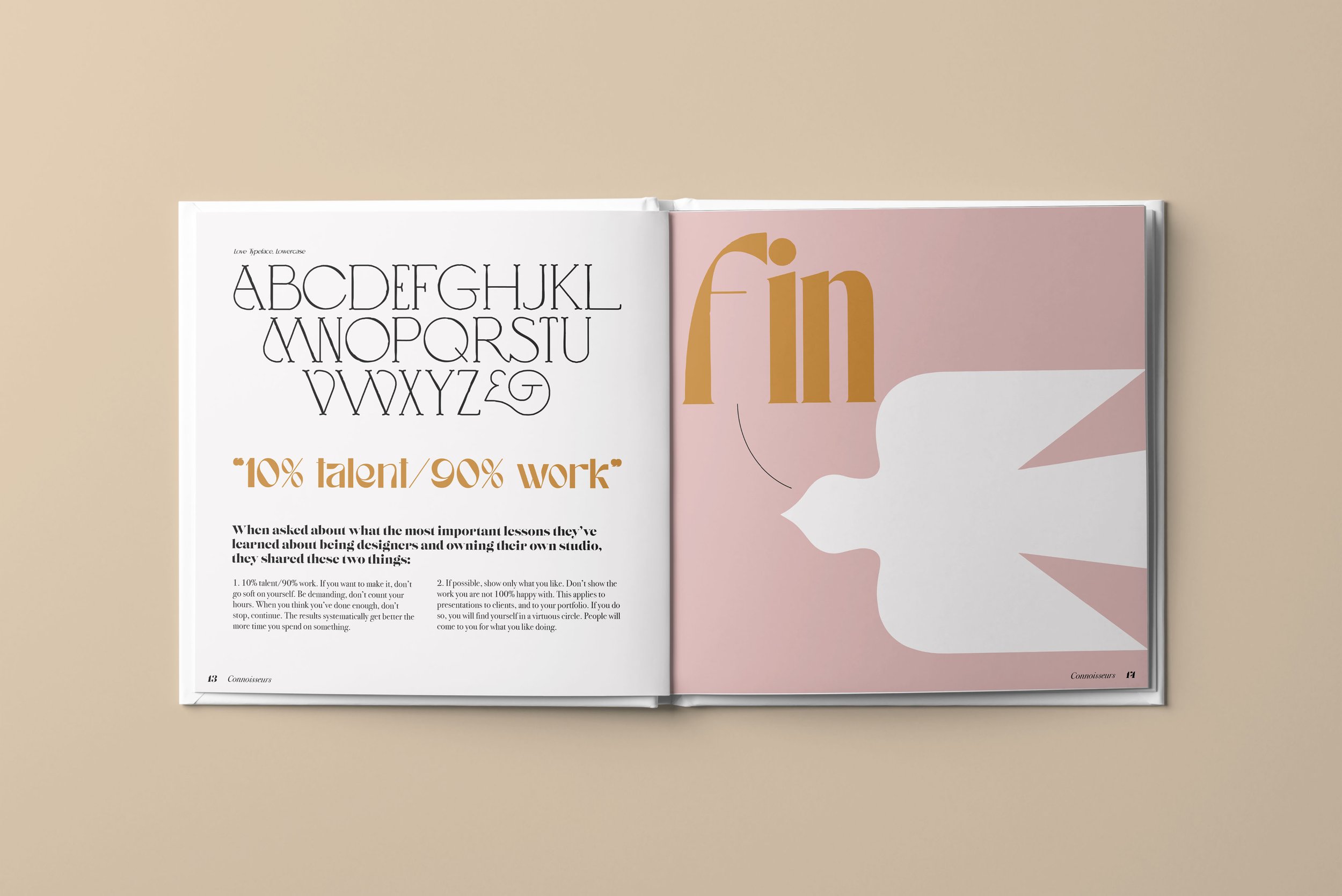
Some challenges I faced with this design was deciding how much I would actually include in these spreads. There was so much to cull through by way of images and designs that I could have highlighted. If I tried to fit too many images on each spread I would have compromised the effortless sense of simplicity and elegance that Violaine and Jeremy seem to achieve with their work. I consciously chose just a few images that spoke for the designs themselves and paired all of the background and font color for the spreads to each individual project. This allowed each spread to shine on its own while still maintaining a cohesive design style. I also included subtle elements like the thin swooping lines to lead your attention to small but important details like font examples or quotes from the designers themselves.
Final Iteration

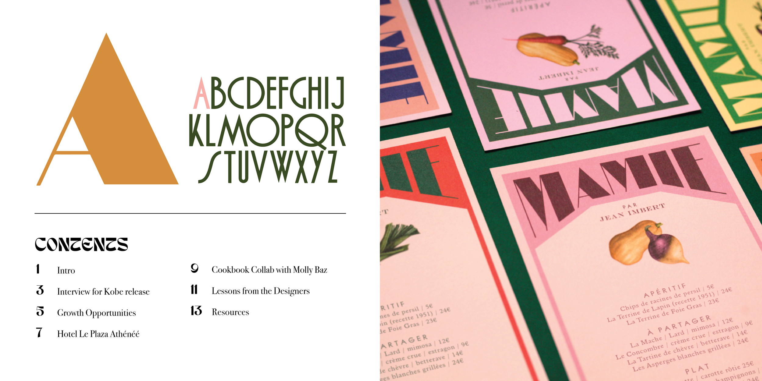

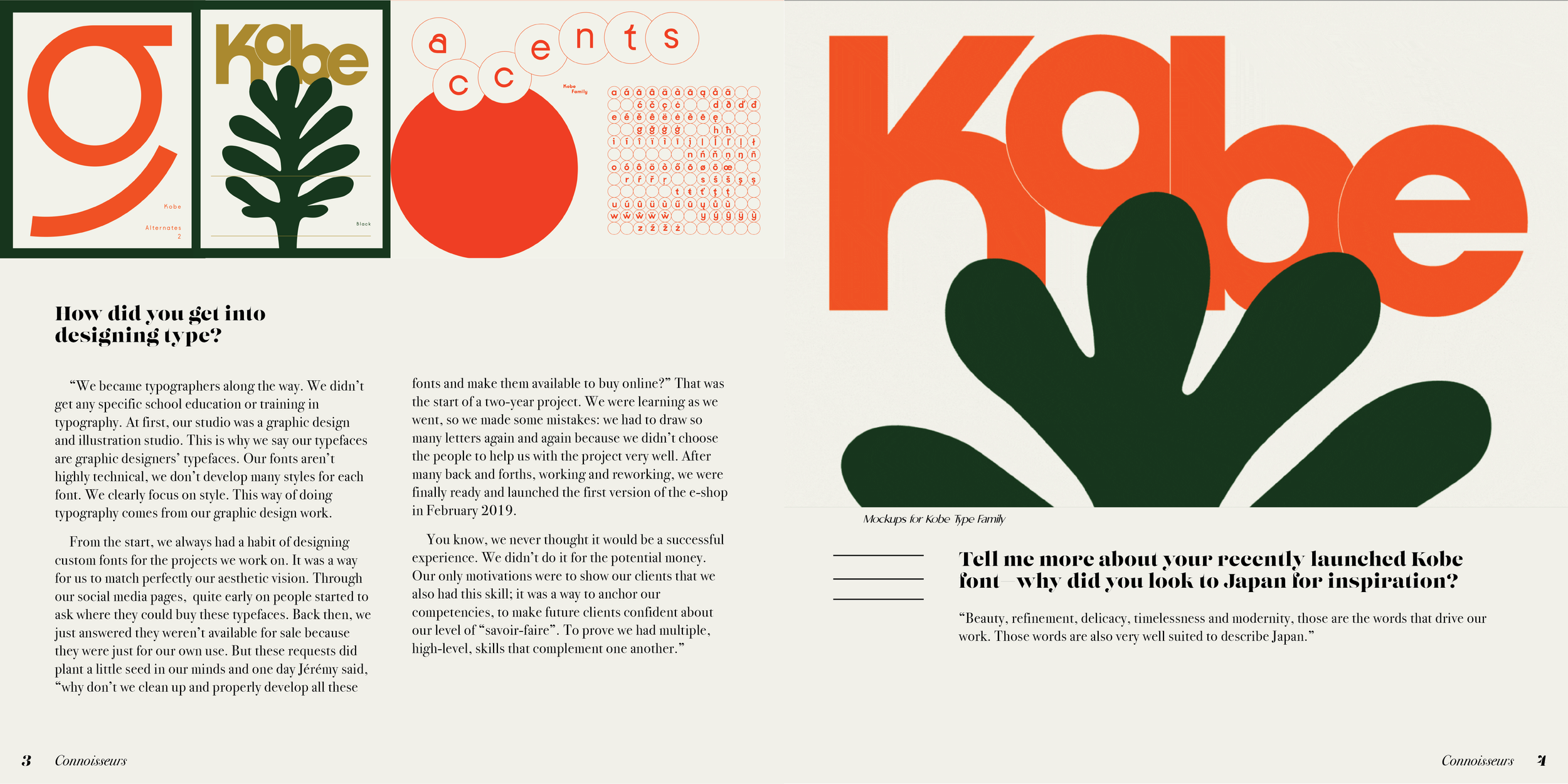
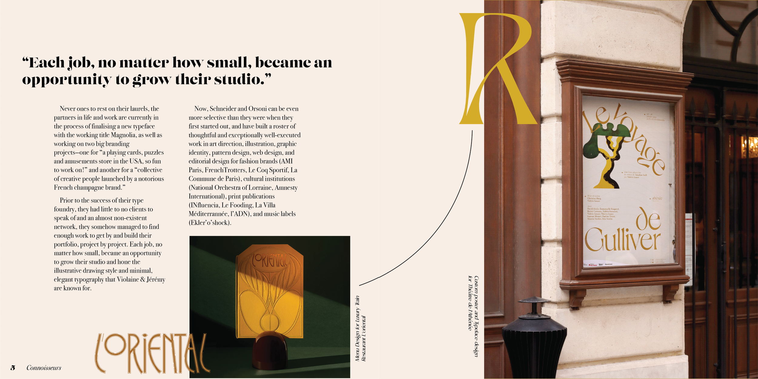
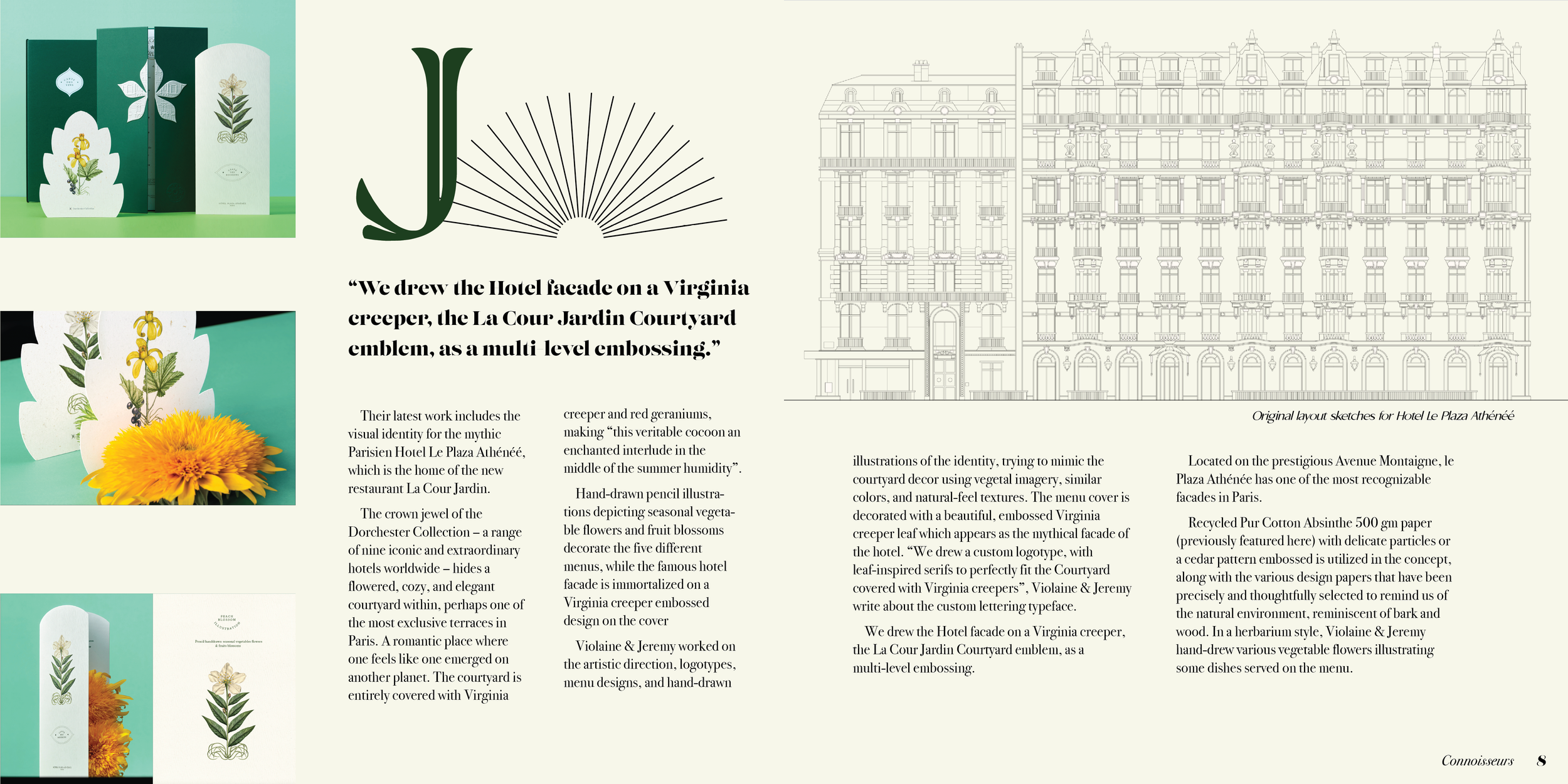
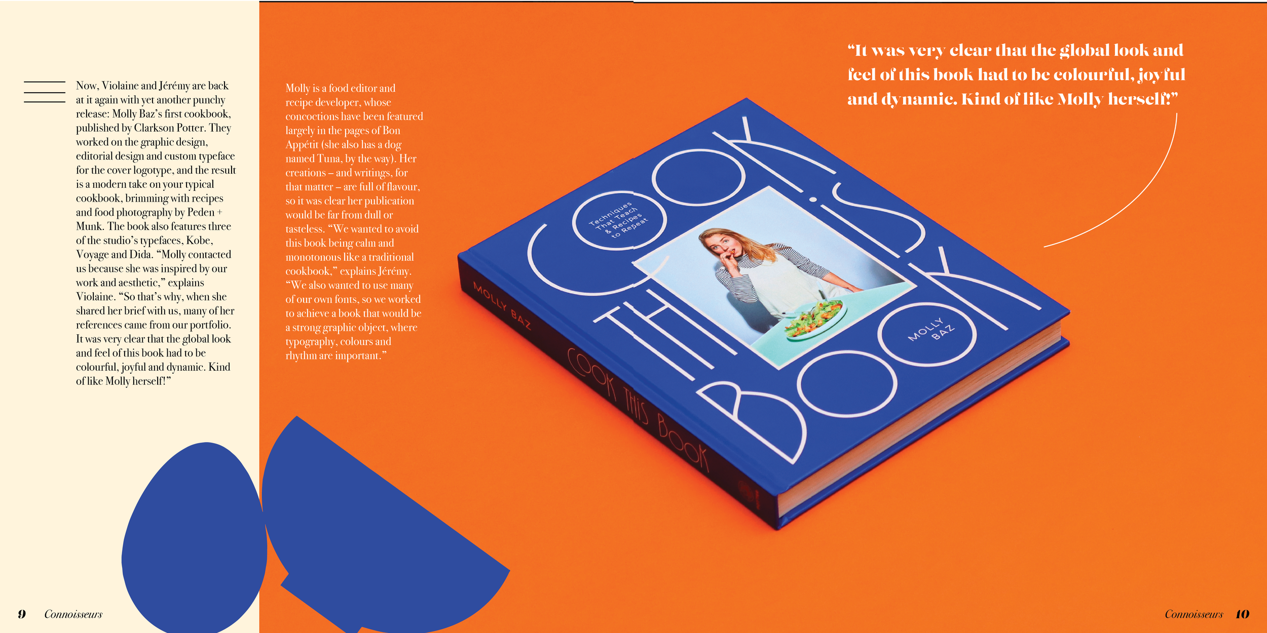
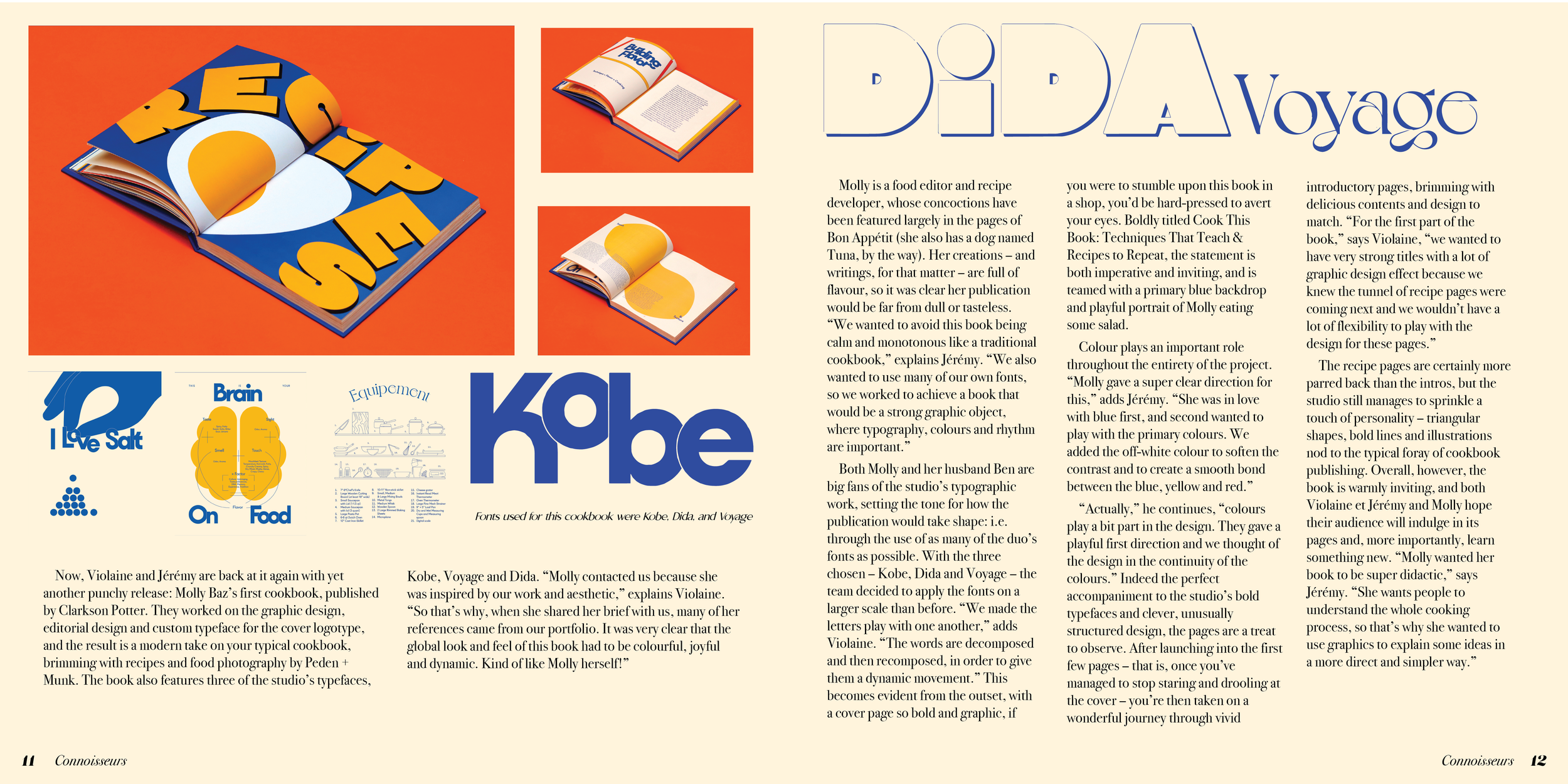
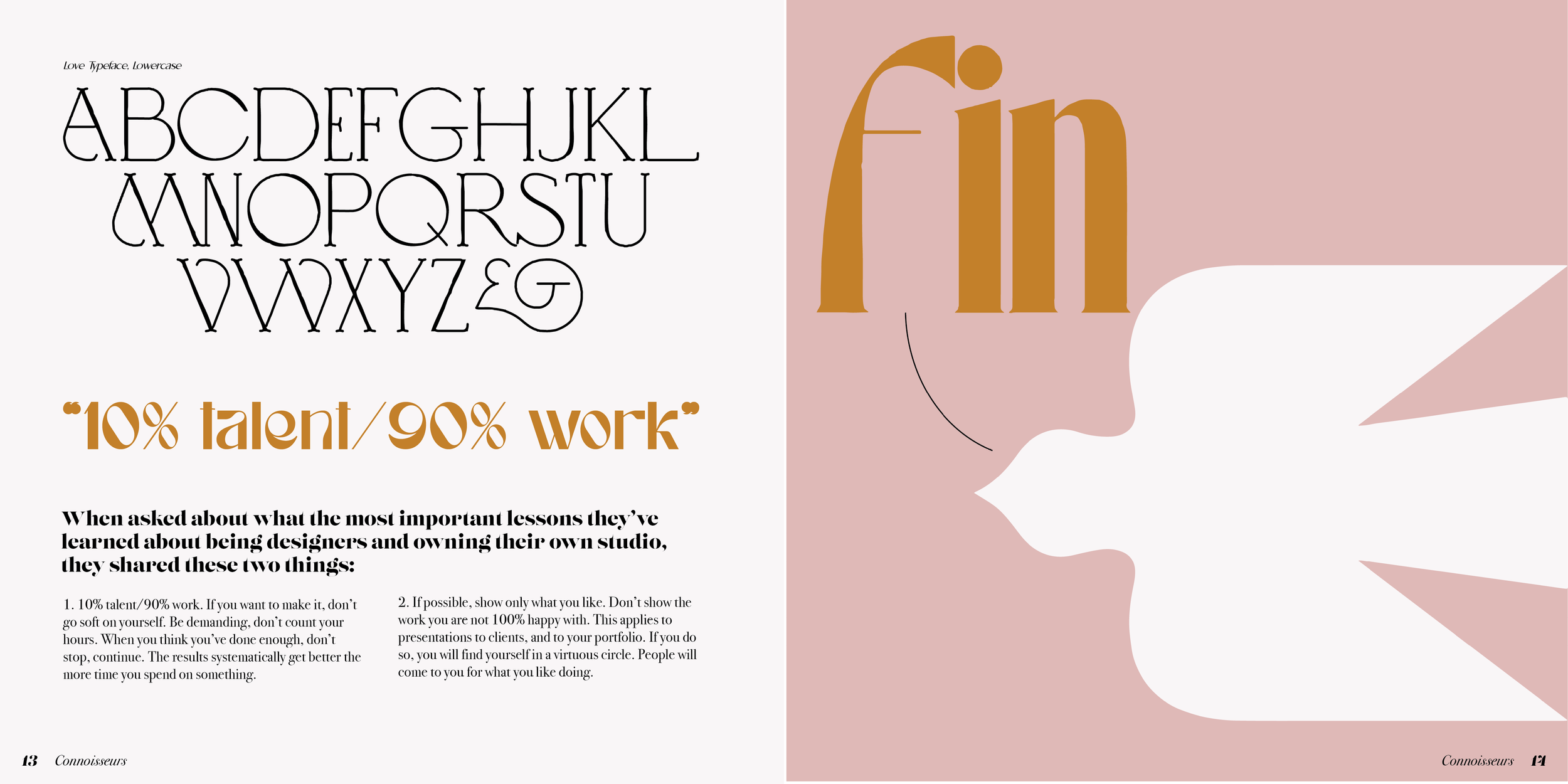
As a longform print design, this was a really engaging project. After pouring over every little detail for weeks to make sure that everything felt balanced and intentional, I learned that print is a really challenging and exciting medium to work in. As with the Font Highlight project, everything looks slightly different after printing. It was really satisfying to compare print to digital form and continue to iterate until the aesthetics matched exactly what I had in mind.
In compiling the type for this project from many interviews that Violaine and Jeremy did with different publications, I felt incredibly inspired by their perspectives of prioritizing time to travel and gather inspiration. If anything, this project solidified my admiration of this couple and their beautiful work.
Mockups
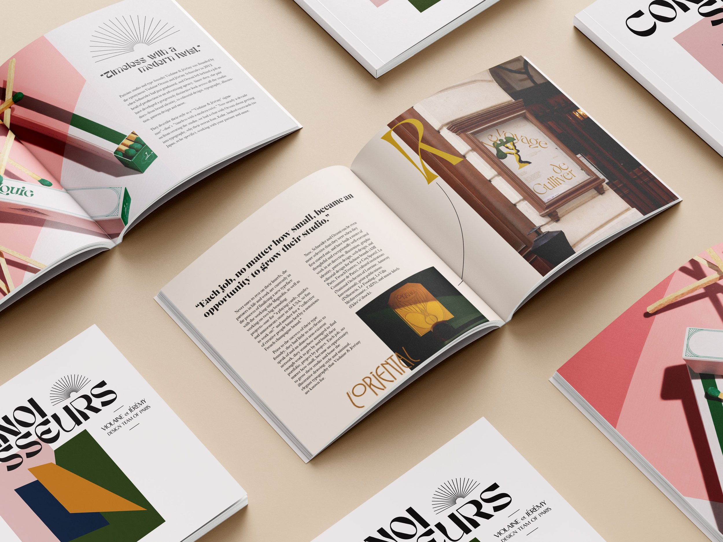



Reflection
In compiling the copy for this project from many interviews that Violaine and Jeremy did with different publications, I felt incredibly inspired by their perspectives of prioritizing time to travel and gather inspiration. If anything, this project solidified my admiration of this couple and their beautiful work.
“When you think you’ve done enough, don’t stop, continue. The results systematically get better the more time you spend on something.”
— Violaine and Jeremy
All images belong to:
Copy Credit for this project belongs to the following online publications:
99 Percent Lifestyle
Design and Paper
It’s Nice That
People of Print


