Ritual Creamer Packaging
I am a morning cup of tea girly through and through. The Ritual of brewing and mixing a custom blend of loose leaf Chai provides a kind of grounding that literally carries me through to the late afternoon. When I was asked to create a drink product, I was inspired by a product made locally in Austin by the coffee company Summer Moon. They create a proprietary blend of creamer called Moon Milk that I will sometimes buy on its own to help with my own morning concoctions. That idea of having a really tasty natural creamer that pairs well with any drink seemed really interesting to me. From there it was a matter of defining the feeling that consumers of my natural creamer would have as they crafted their own morning rituals.
Discovery
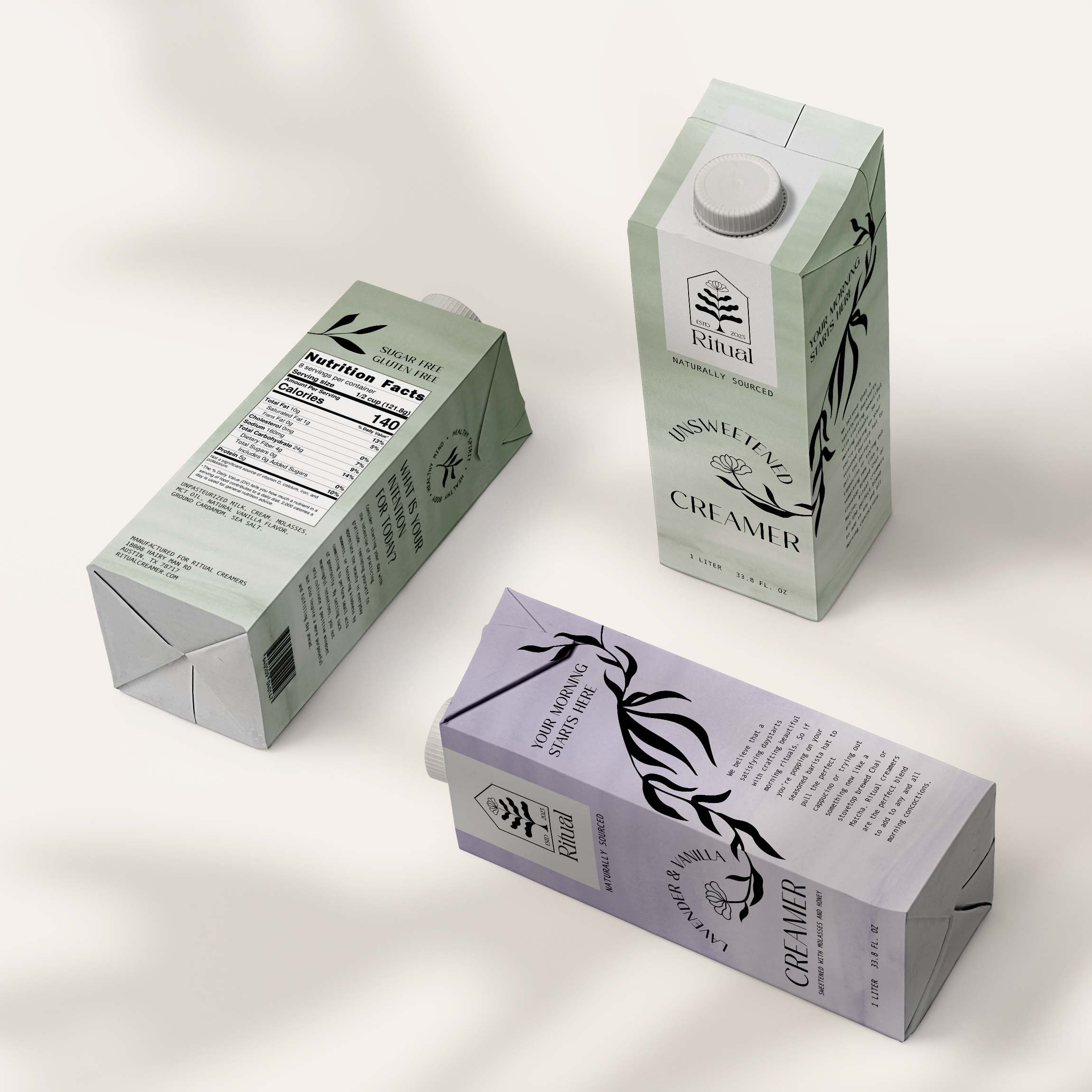
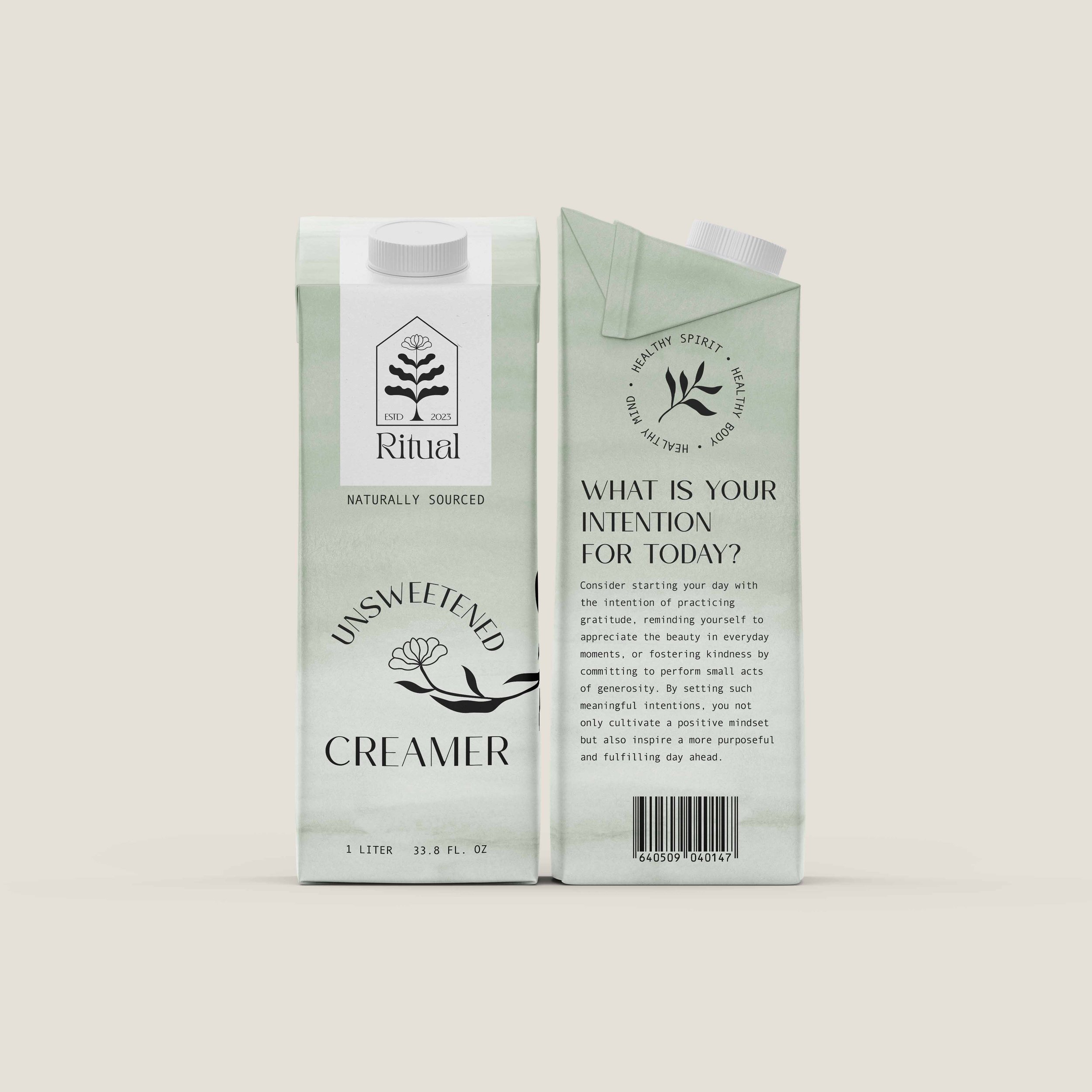
For the brand image I wanted the aesthetic of this product to look elevated and soothing–like something you’d see in the fridge at a yoga studio or locally curated food co-op. The purchase comes with it the aspiration of having a grounded and indulgent morning without compromising health or taste. To convey this concept, I chose very comforting cool colors with a watercolor texture. I pictured the value of this product in the idea that you can get this very artisanal and botanical taste to your morning drink at home without spending the seven or eight dollars at an expensive cafe. The key words I kept in mind for this were: natural, elevated, soothing, and artisanal.
Sketches
Challenge
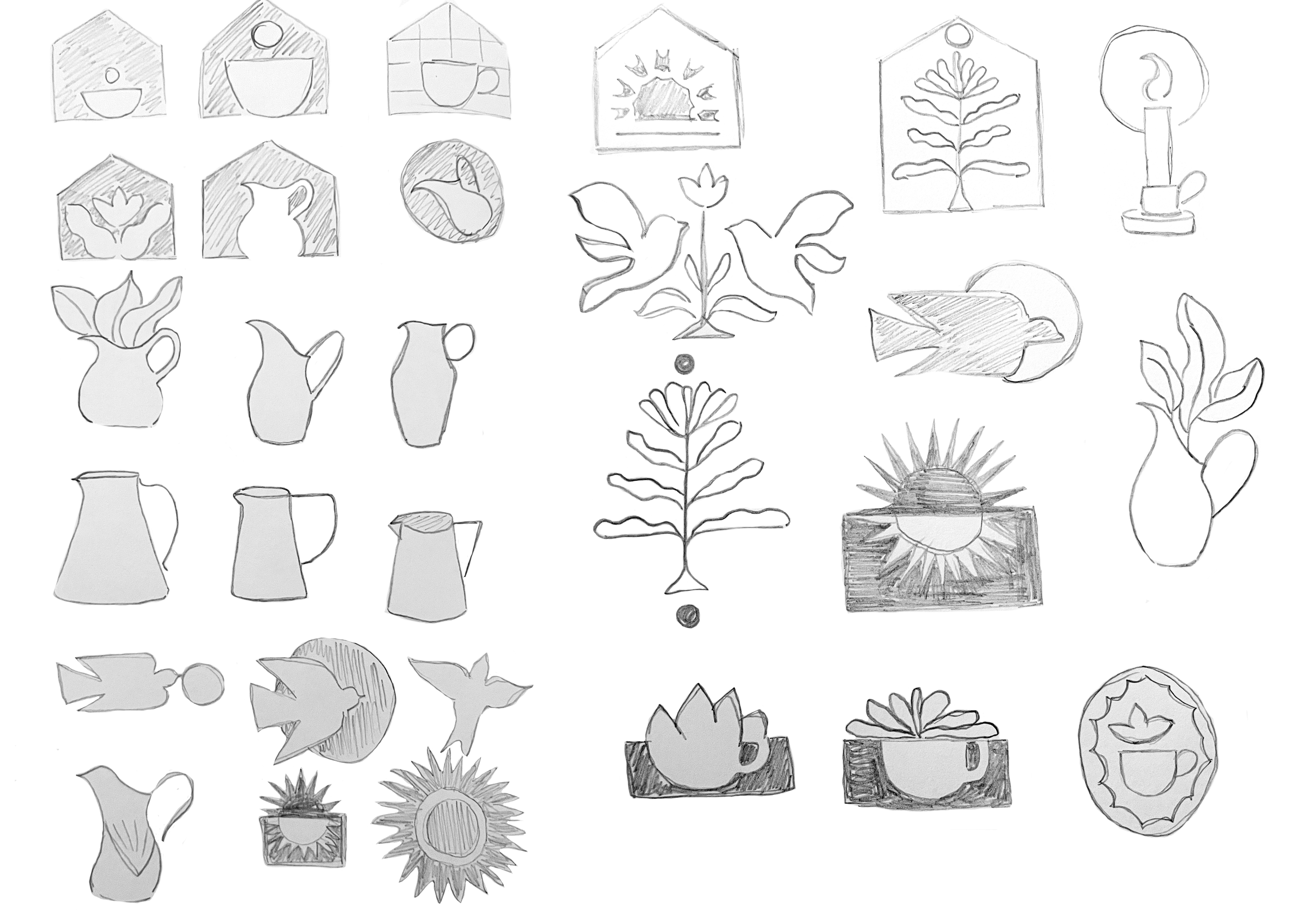
To get the logo to a place that really matched the concept I was working with, I played with different versions of plants, morning birds, and cups. Ultimately I was drawn to having the house shape as a border to the logo as a reminder that this is a product best used in your own space. When I got to a version of the plant that I felt happy with, it took a while to strike the right balance of filled shapes, line weight, and size before things felt equal across the design system of the packaging.
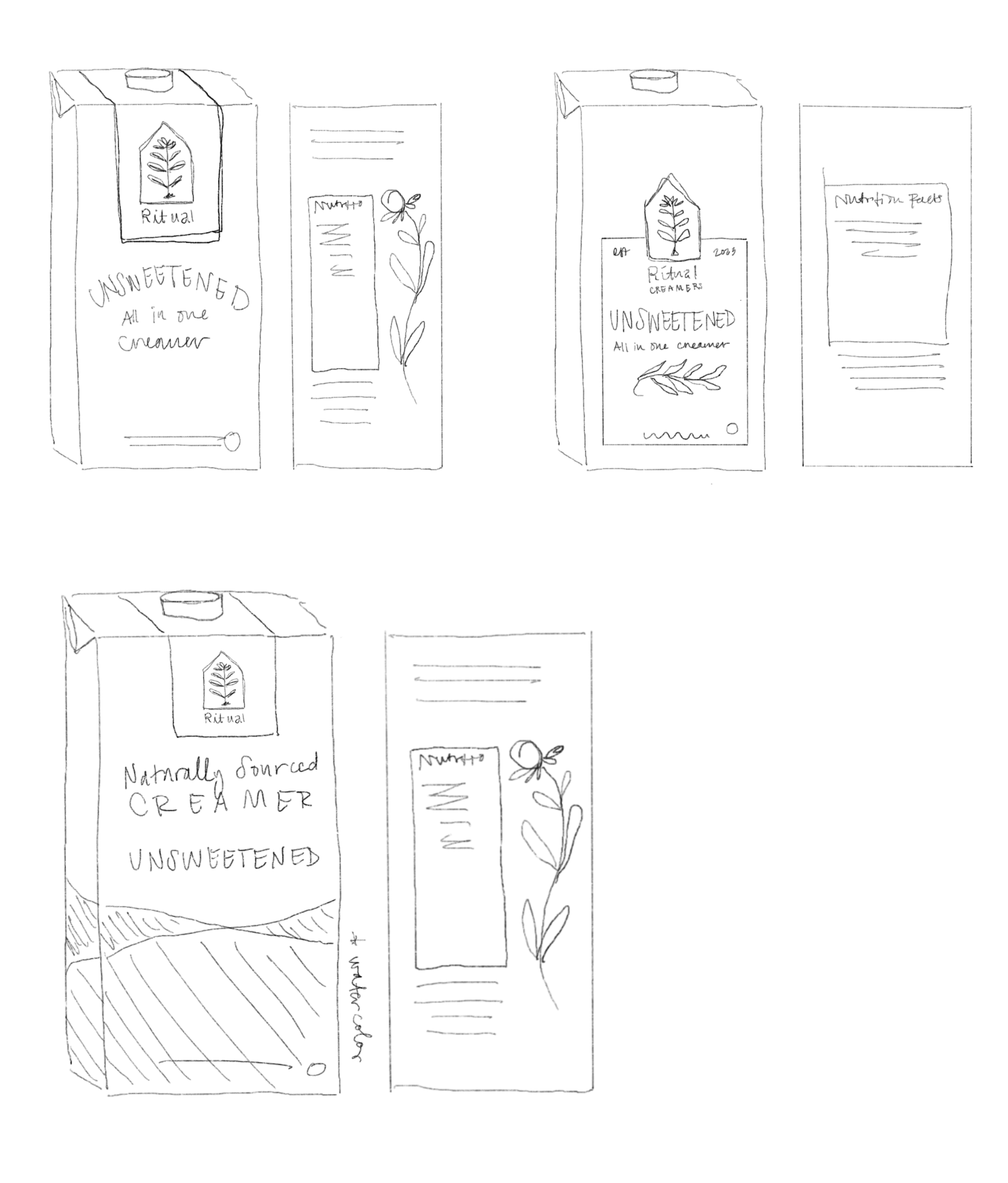
The next big design challenge was striking the right balance of spacing and wrapping of the illustration. Because I’m a designer and avoid typography widows like the plague, I made sure to adjust fonts across packaging while keeping the width of text boxes and copy length in a good place relative to the overall voice of the product.


Final Iterations
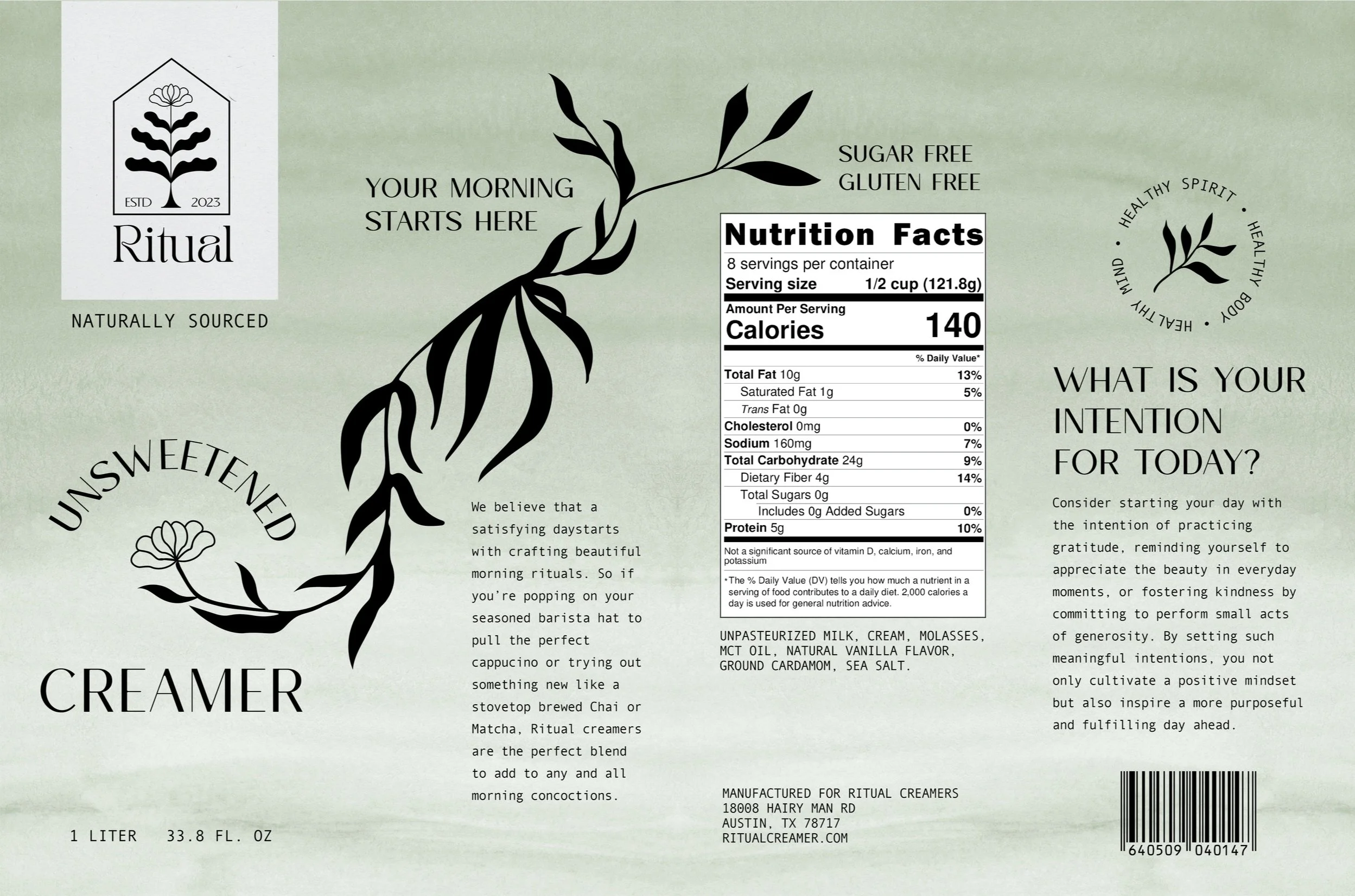
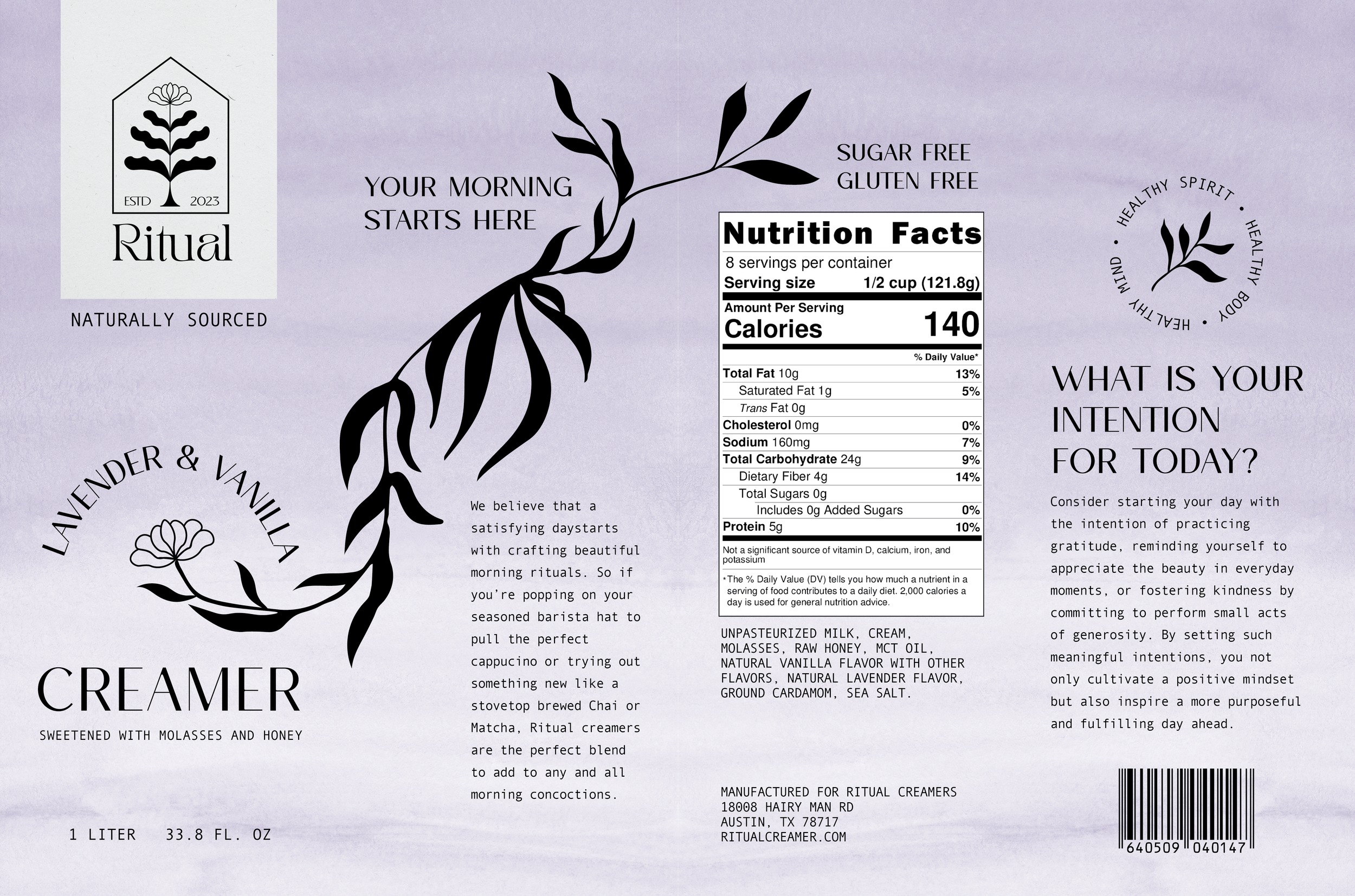
When it came to the final logo design, ultimately I chose to keep the logo leaves filled with black so that they felt more cohesive with the leafy vine illustration that wraps across the box. I also changed the font pairings because I realized my love for Art Nouveau was really coming though, but it wasn’t quite right for the overall feel of this product that I was trying to achieve. I went for a more arthouse coffeehouse aesthetic with the font pairing and customized the logo font a little further to feel more custom.
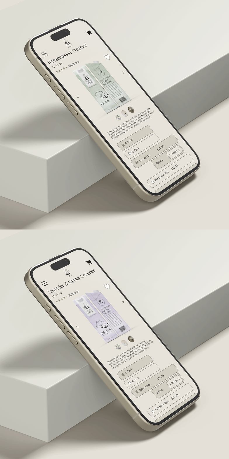
From there, I found some really decent mockups and created a mobile product listing page for each of the creamer flavors. It was really fun to learn more about making gifs in Photoshop with this project.
Mockups

Reflections
This project was a lesson to me in learning where the line is between choosing personal style over the project brief. The changes I made between the drafts to the final version were subtle but I think very impactful. When it comes to maturing as a designer, there’s a lot to learn about defining the product strategy and staying true to the project brief even as it evolves past the original design inspirations. This is a product that I would absolutely put into production if I had all the resources to do so. I’m a morning ritual person through and through and it would be interesting to see if there would be a greater community out there who share the same sensibilities and style.


