Font Highlight Brochure
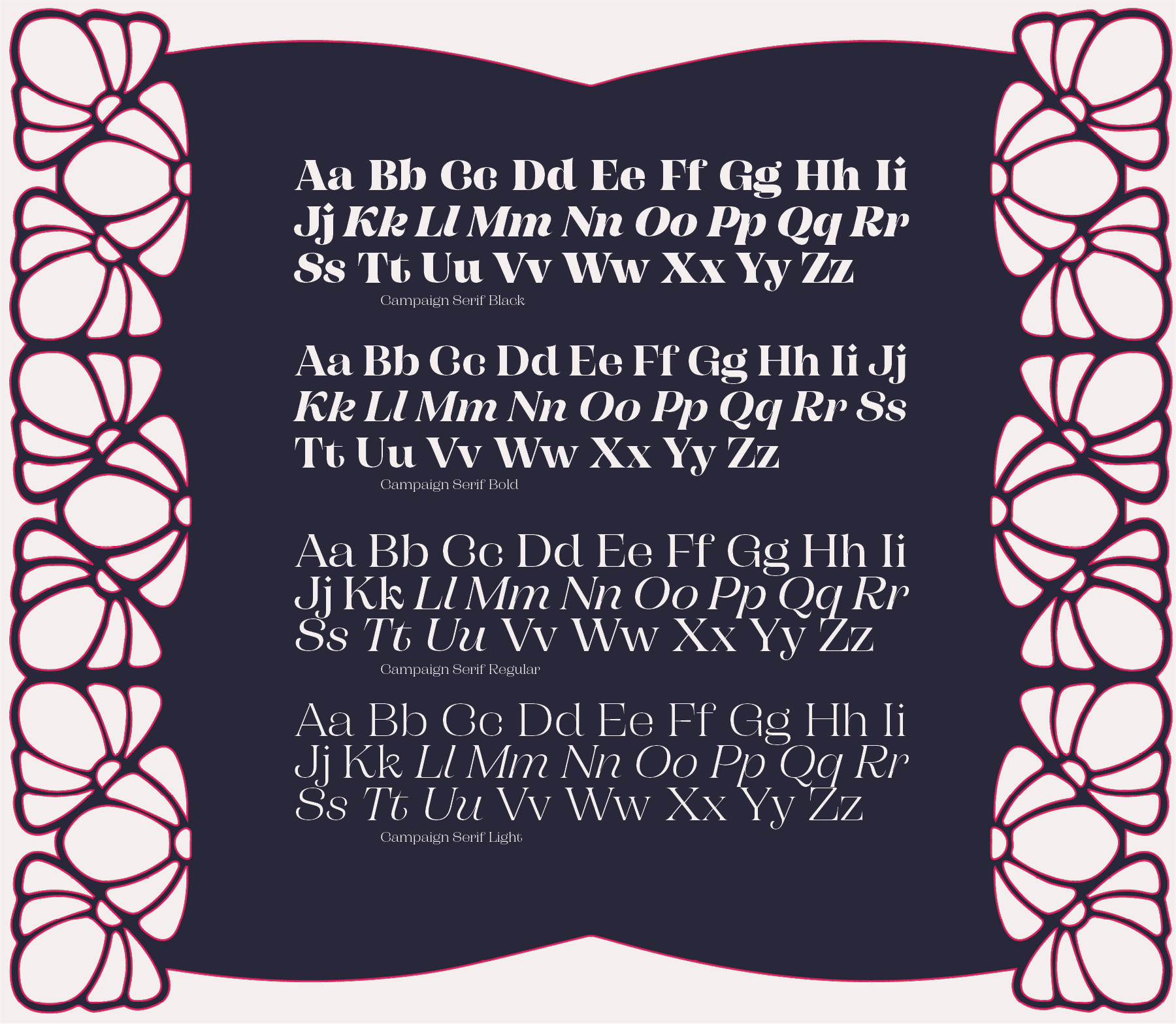
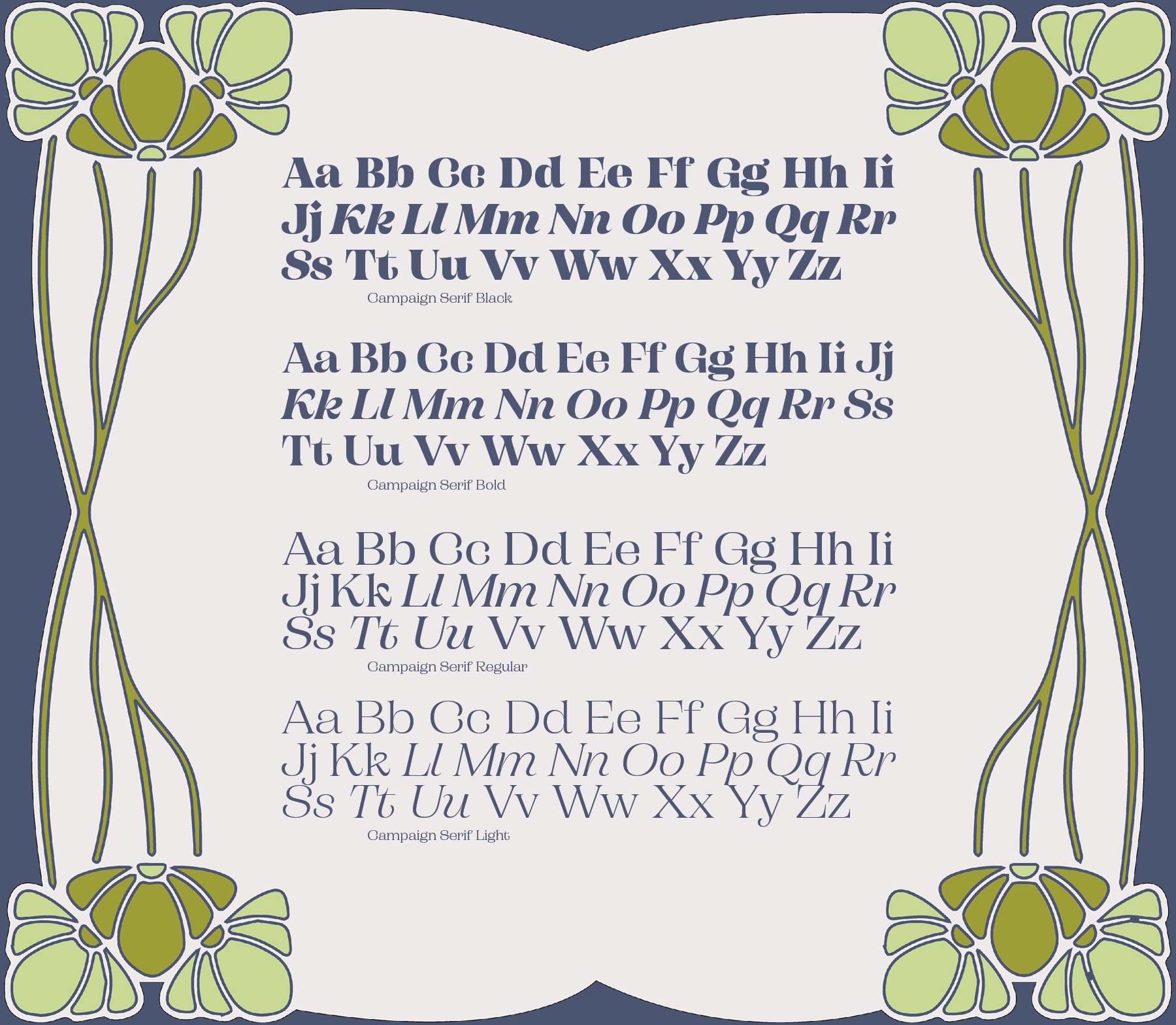
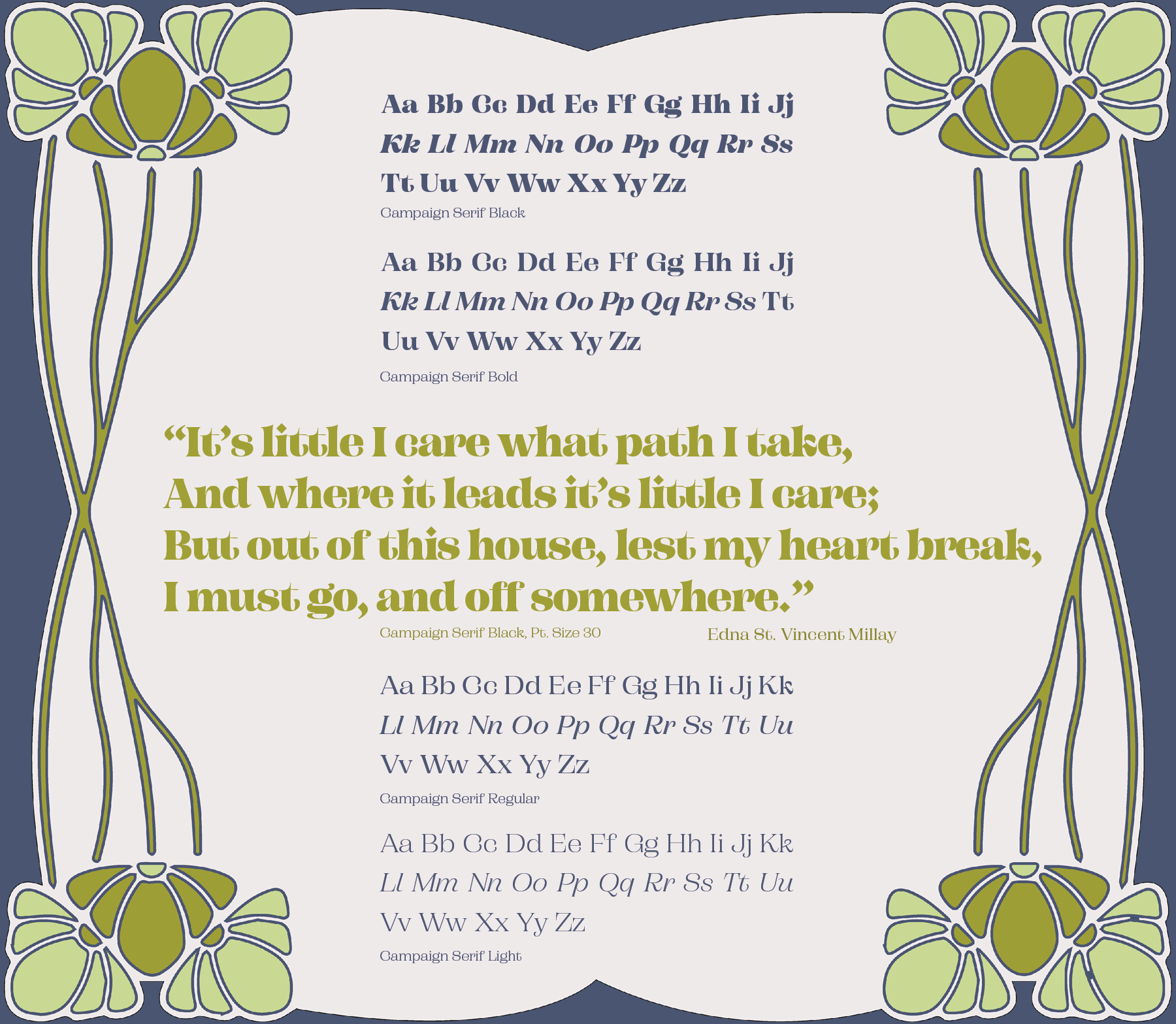
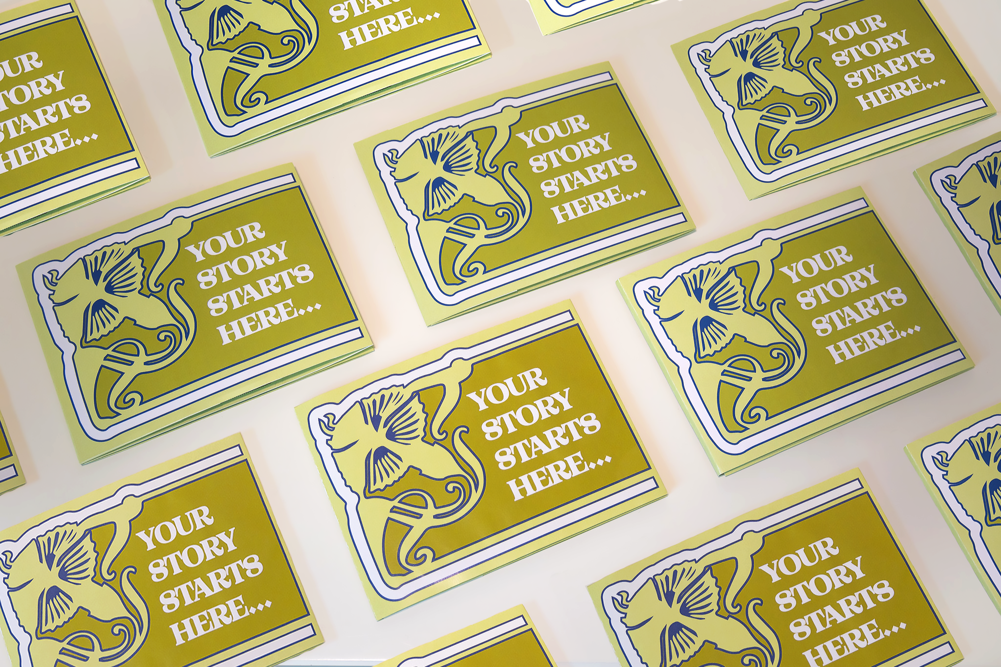
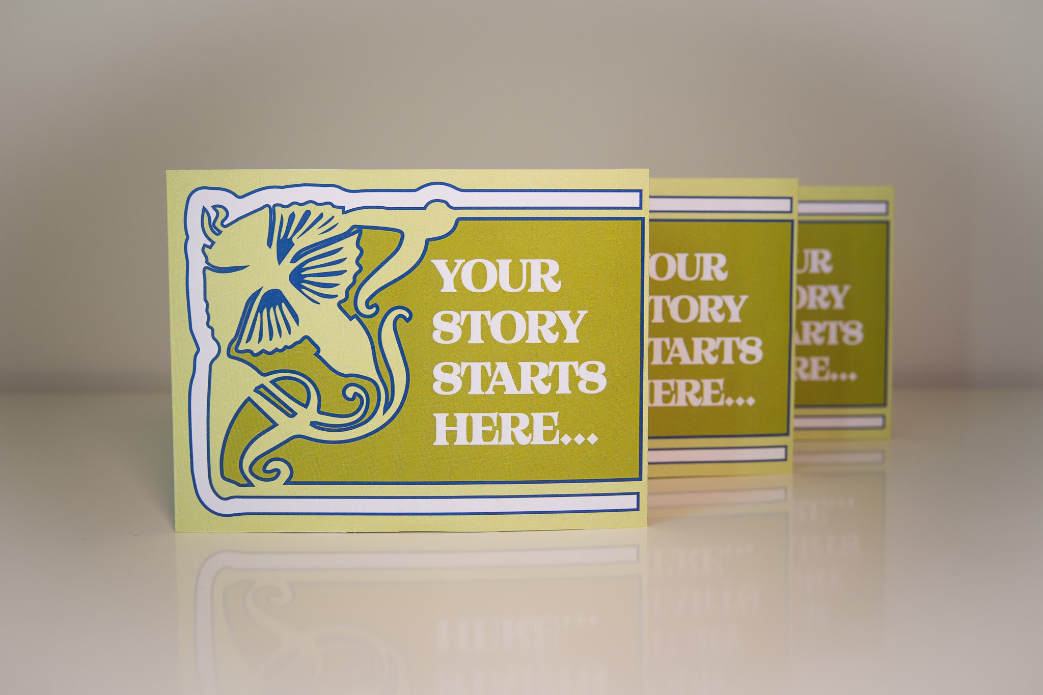
My task with this project was to come up with ideas and designs for a foldable print design that could be mailed out to designers that are looking for new font inspirations. The goal was to show the full scope of the font family and an interesting context in which it could be used.
The two things that really influenced me with this were pairing an Art Nouveau style and color palette and a pop-up subway map of London I found amongst my Nonnie's map collections. I'm always looking for interesting sources of inspiration for design so I knew immediately that I needed to make a template of this interesting pop out map for this project. For the featured font, I chose Campaign Serif which had some classic Nouveau characteristics without being too blatantly vintage to not be able to use in a modern context.
Discovery
With this being one of the first projects in my degree where I was given full creative license, I was so excited to use this pop-out template I’d made. Creating the map was certainly the easiest part, but I felt quite intimidated at first by finding enough inspiration for filling the large pages with helpful information and aesthetic visuals. I spent a lot of time looking through examples of Art Nouveau posters and examples of marketing materials on the Library of Congress archives to find enough inspiration. What really stood out to me was this idea of using illustrated hands to show the receiver of the mailer where to pinch the paper to open the pop-up portions. I also discovered the magic of public domain illustrations that I worked with in illustrator to customize the text-color balance.
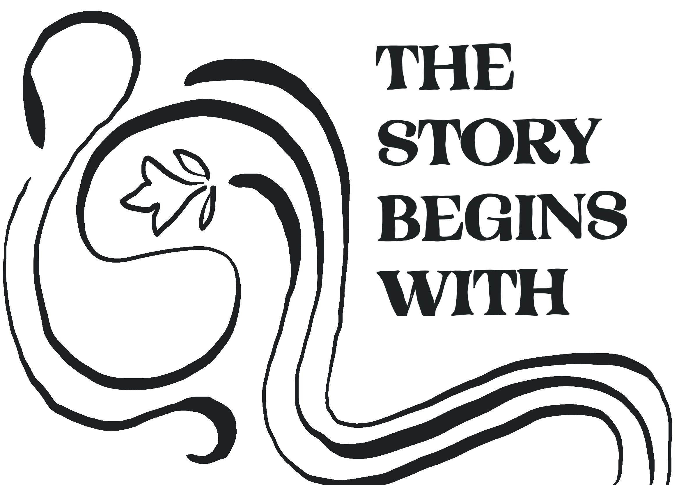
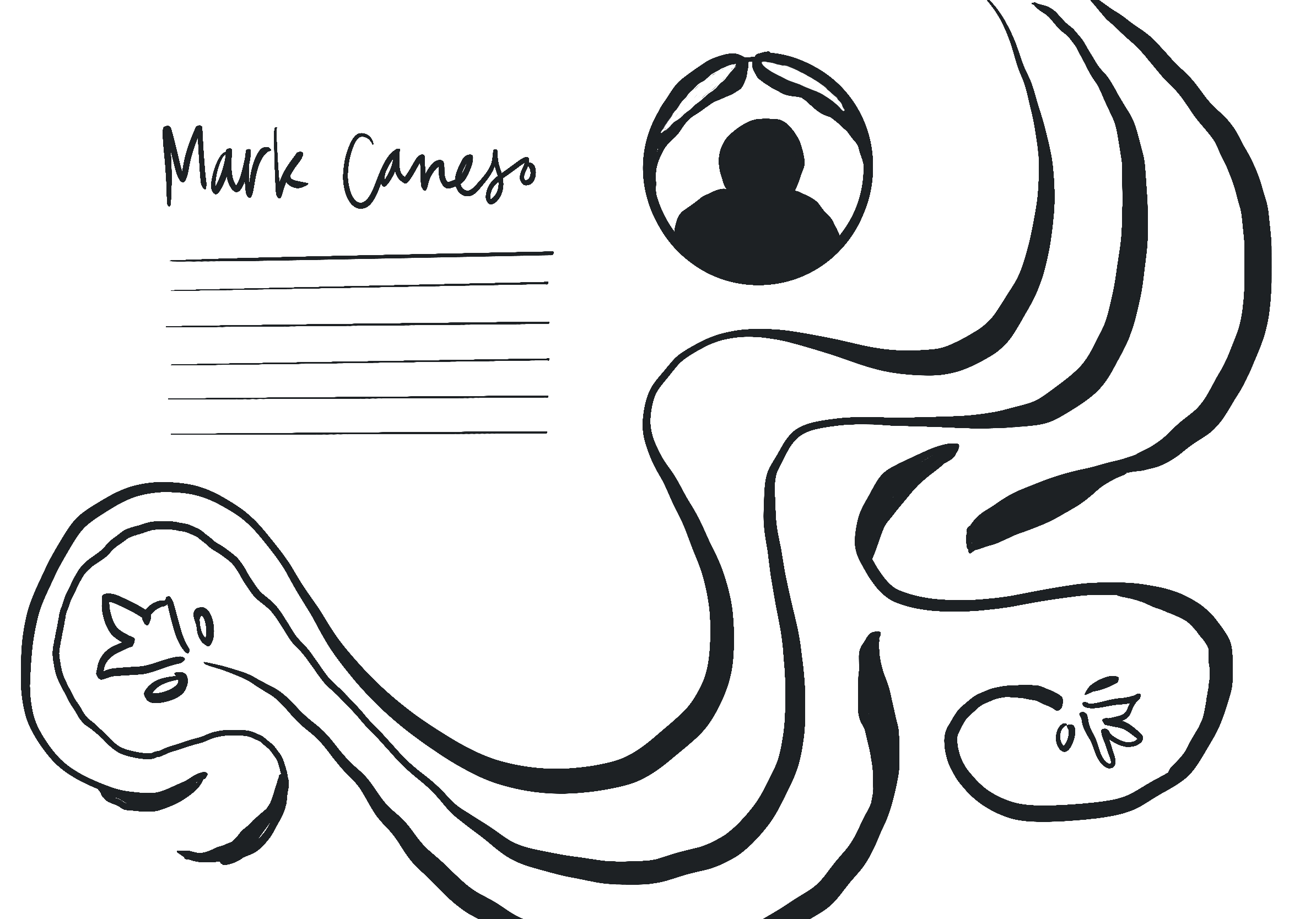
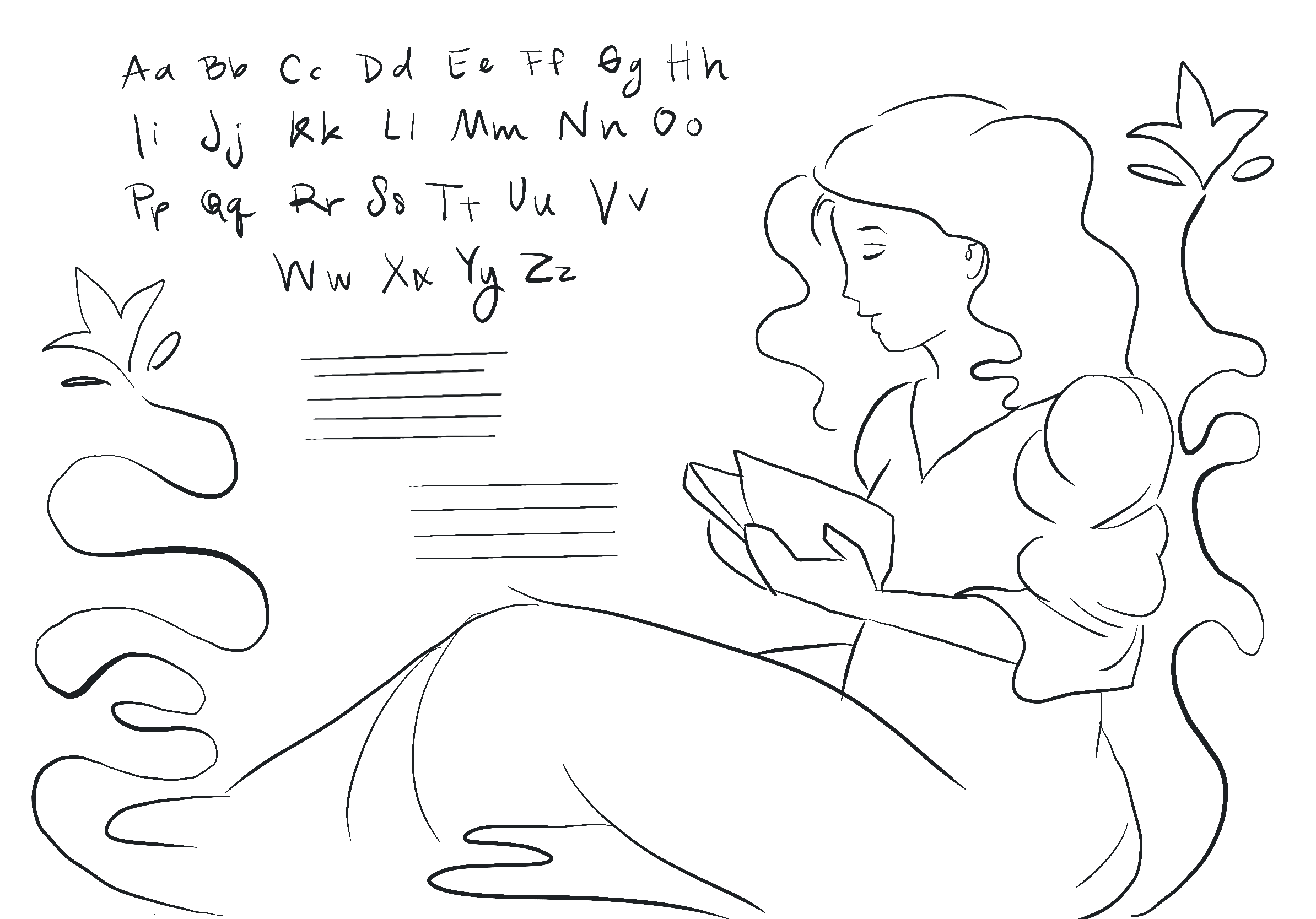
Sketches



Challenge
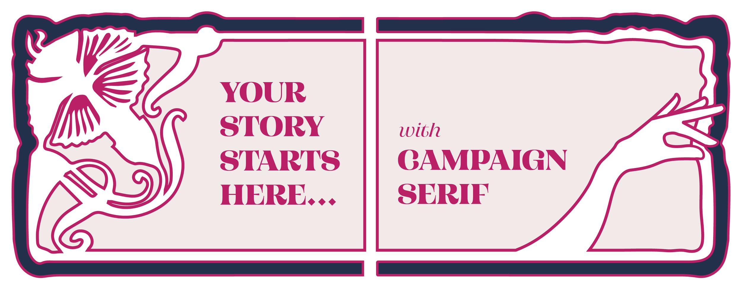
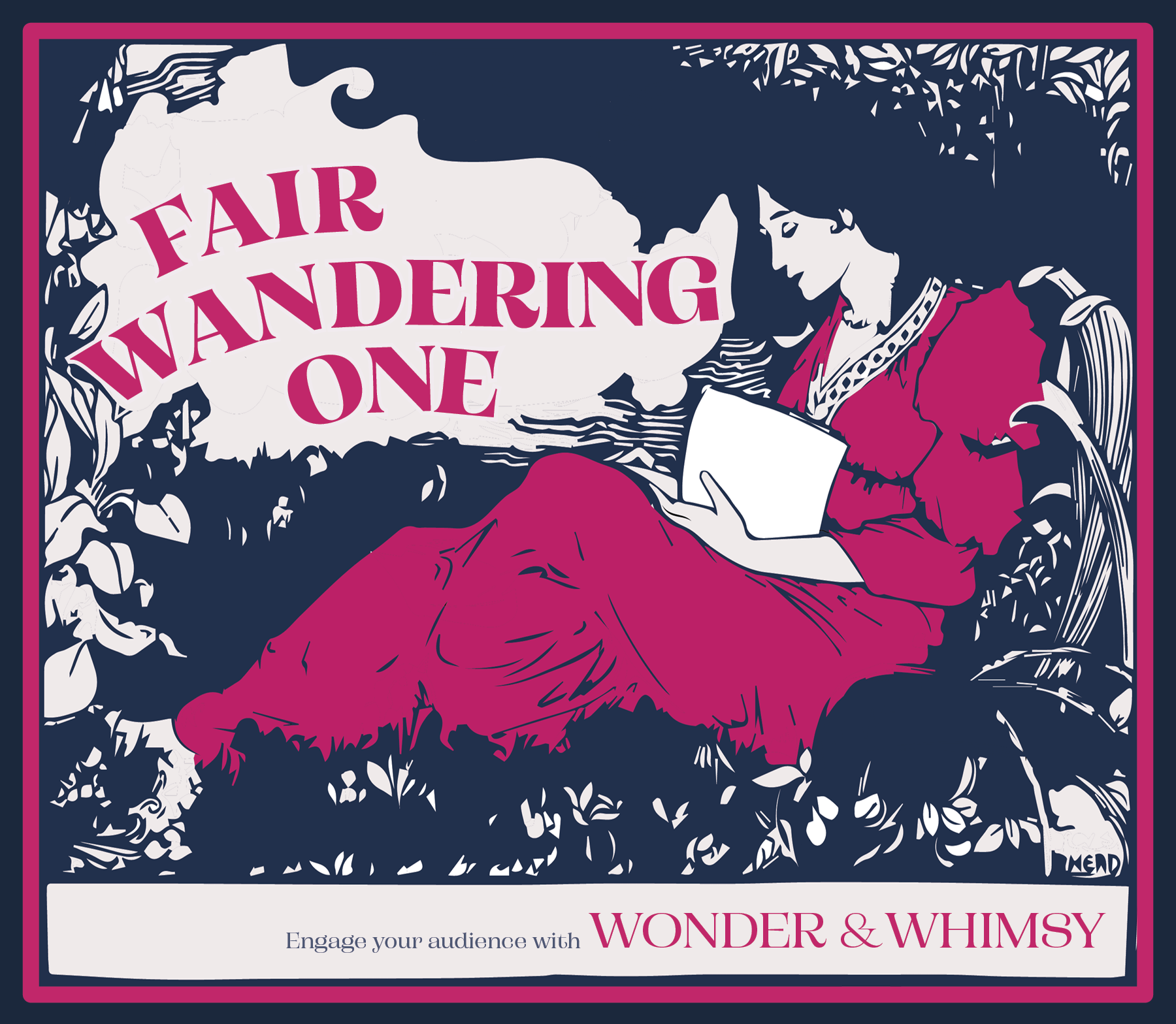
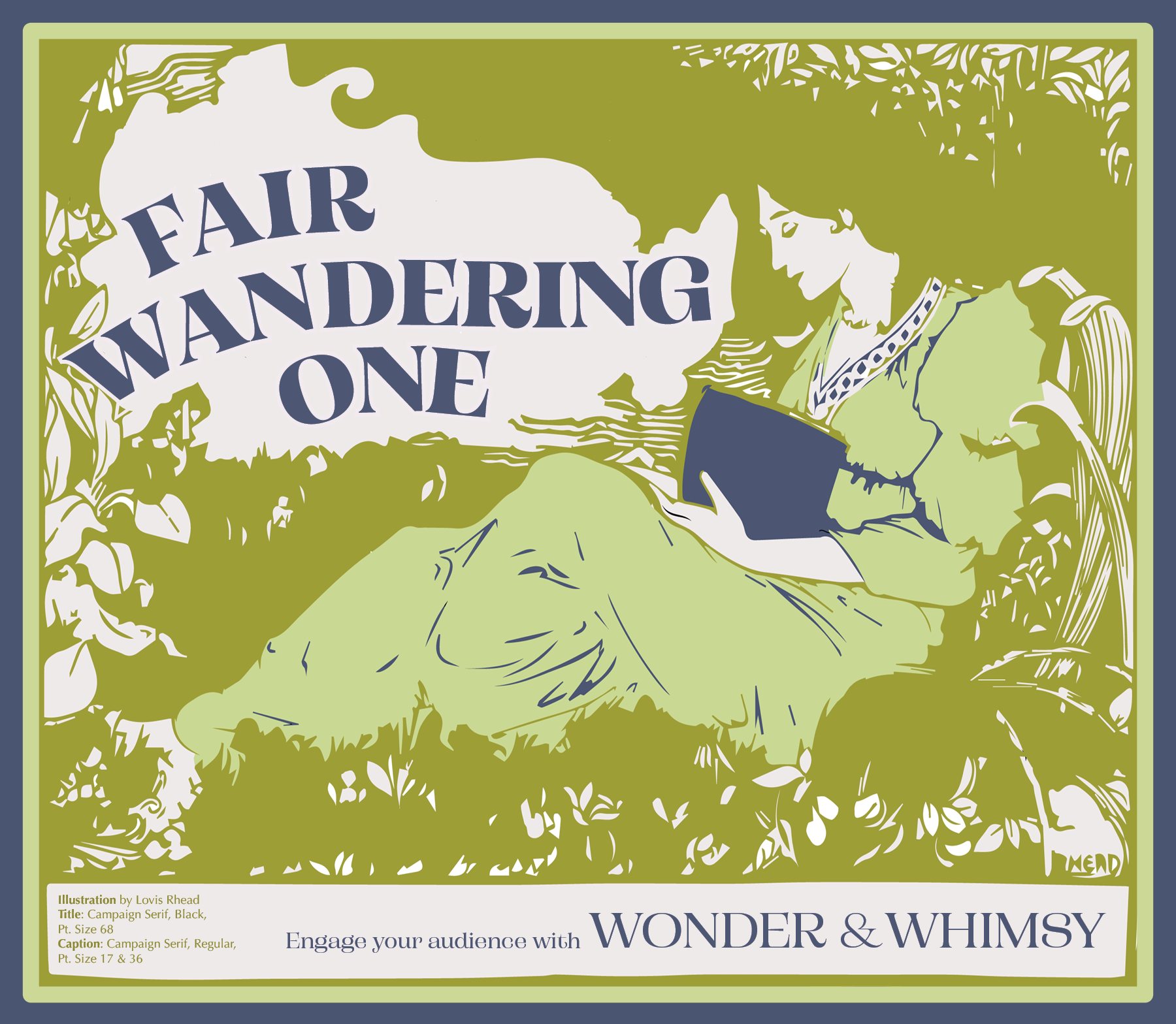
One of the interesting challenges I faced with the design of the inside pop out pages was allowing the text and illustration to be intricate without losing any quality from the folding. I kept the color palette very simple with a very vibrant green that felt grounded but modern and playful. The two pages balance each other out very well with the image heavy design on the left and text heavy design on the right. For the illustration, I blew out much of the detail so that the darker text could really stand out in the illustration. It took many print iterations and folding samples to get this template just right.
I was restricted somewhat with only having access to 12x18 sheets of paper which meant that I needed to plan for an overlap of the main folder. With each version I went back and adjusted the spacing until the designs felt centered on each fold and the piece, once glued together, felt polished and complete.


Final Iteration
From the very beginning of this process I was inspired by very whimsical posters and illustrations from the Nouveau time period that I wanted to bring that style into the modern era. I think I achieved a good balance of this by keeping a very simple palette that is much more saturated than materials of the time would have been. I also included the mushroom details to bring a bit of 70’s psychedelic era into the mailer design. One little detail that I feel quite proud of is that I included a poem from my namesake, Edna St. Vincent Millay, who started writing poetry early in the early 20th Century; it felt very time appropriate.

Mockups


Reflection
This was the project that helped me really put typography and design principles to use. I wanted the practice of using type dominant designs and image dominant illustrations that worked in tandem to feature the font that I chose.
I was unbelievably giddy with the first test print and was fascinated by the process of prototyping this project. While I doubted my ability to come up with an interesting design for each of the panels, I really felt empowered by the entire design process and felt my excitement and inspiration growing with each iteration of this project.


