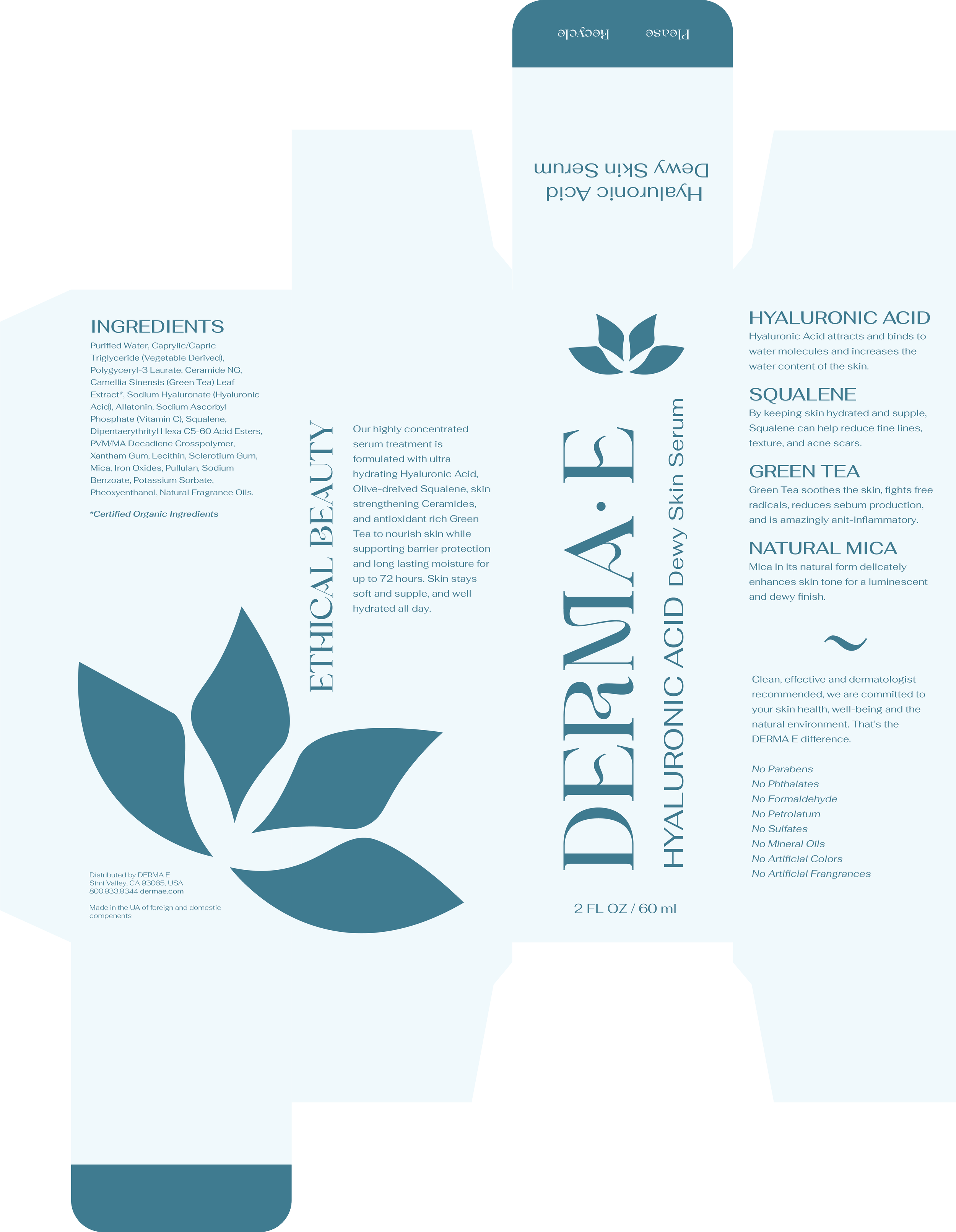
As a woman who dealt with hormonal acne for years before finding the perfect skincare routine, quality skincare products have always drawn my attention. With this project, the goal was to take a product that I found inherently useful and redesign the packaging to match a more accurate aesthetic to its audience. In searching for a product to use, I intentionally looked for a brand that seemed to blend in a little too well on the shelves but still featured the same ingredients I typically look for in more botanical and elegantly designed skincare brands. After a brief trip to Target, Derma-E became my chosen rebrand project.
Derma-E Packaging Redesign
Discovery
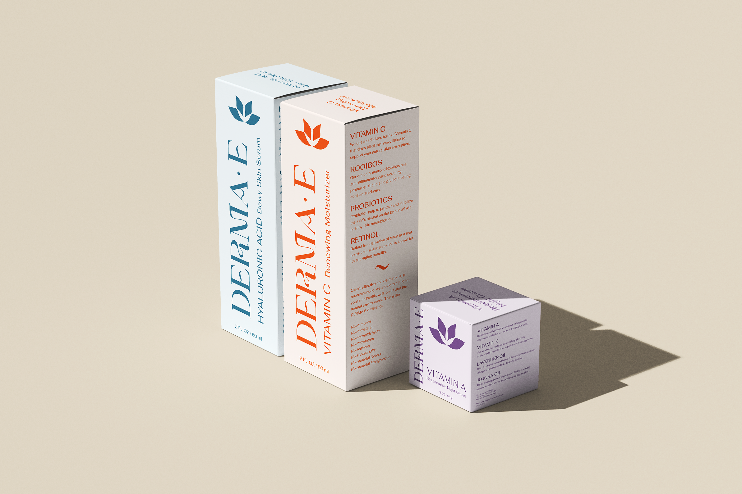
Because one of the issues I was trying to solve is that the packaging blended into the aisle a little too well, I wanted to feature a unique and playful typeface with a bright, but not blaring, color palette. This redesign is meant to catch your eye and seem reliable in a big box store environment as well as a locally sourced curated goods boutique.
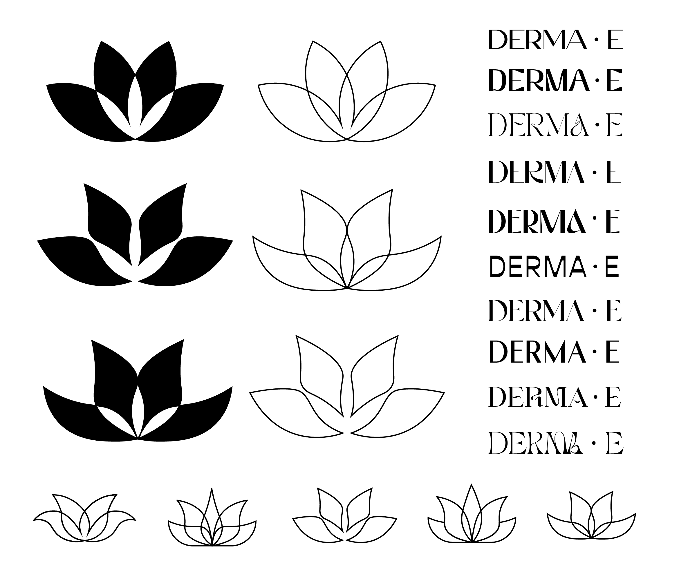
Another feature I wanted to highlight was the unique logo that had very little chance to shine on the original packaging. I brought this to the forefront of my designs while also remaining very type-focused to enhance recognition and readability. The achieved effect is warm, fresh, modern, and retains all the elegance of a brand you might see with twice the price on its skew.
Sketches


Challenge
Something I came up against while working on this design is that the original product packaging was very unique. The original design features a very slim and tall box and it was virtually impossible to find a mockup that fit the dimensions of the original design. I settled on altering the design slightly to fit the size of mockup boxes that I felt still matched the aesthetics of the redesign.
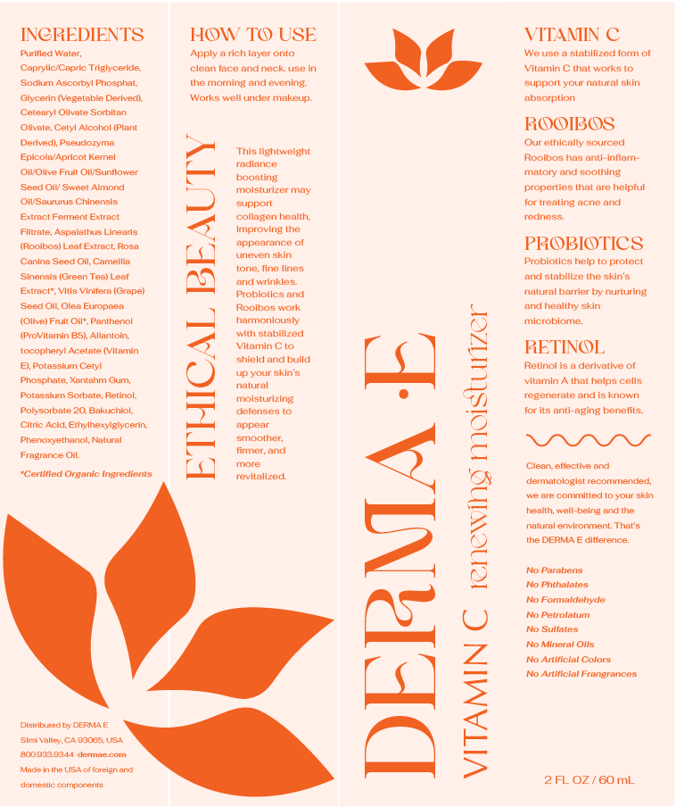
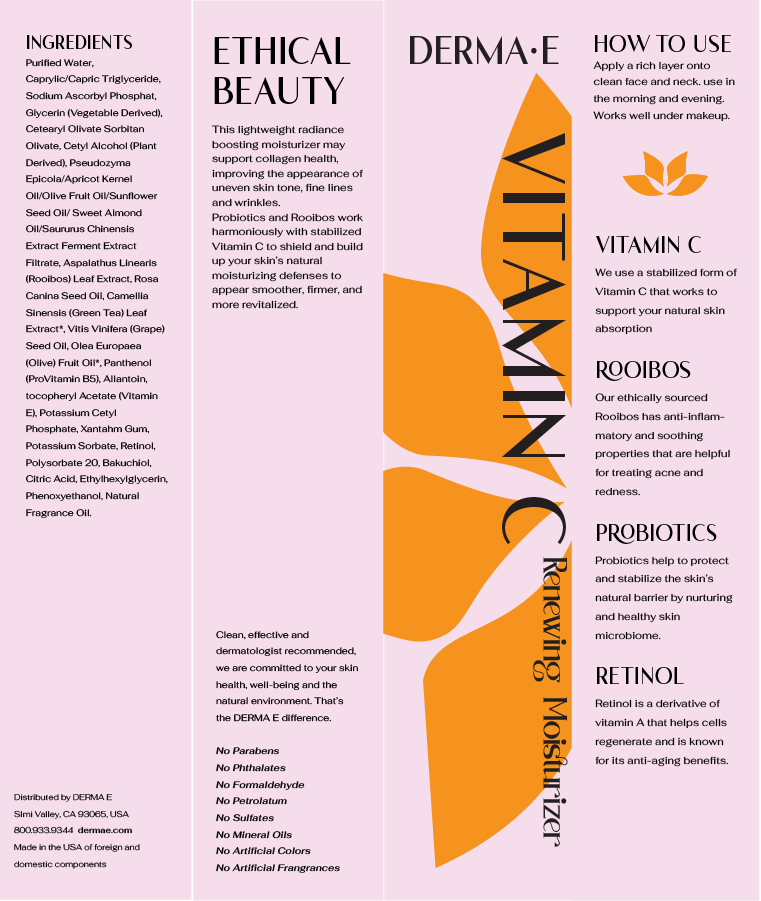
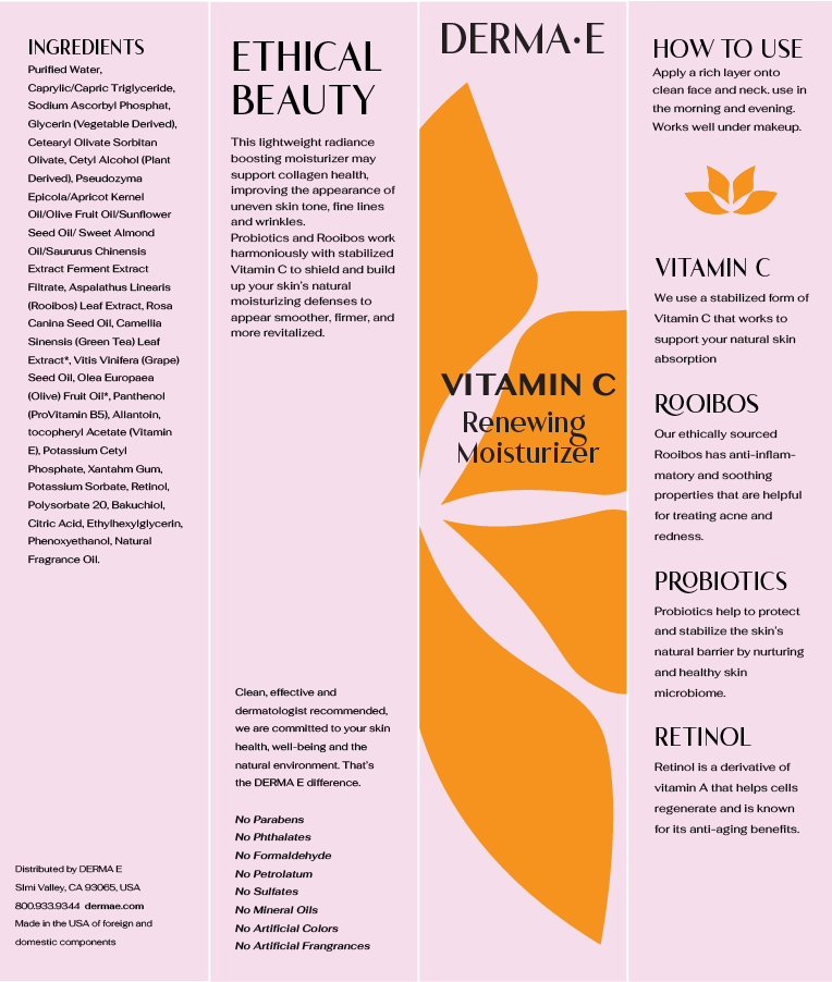
Final Iterations
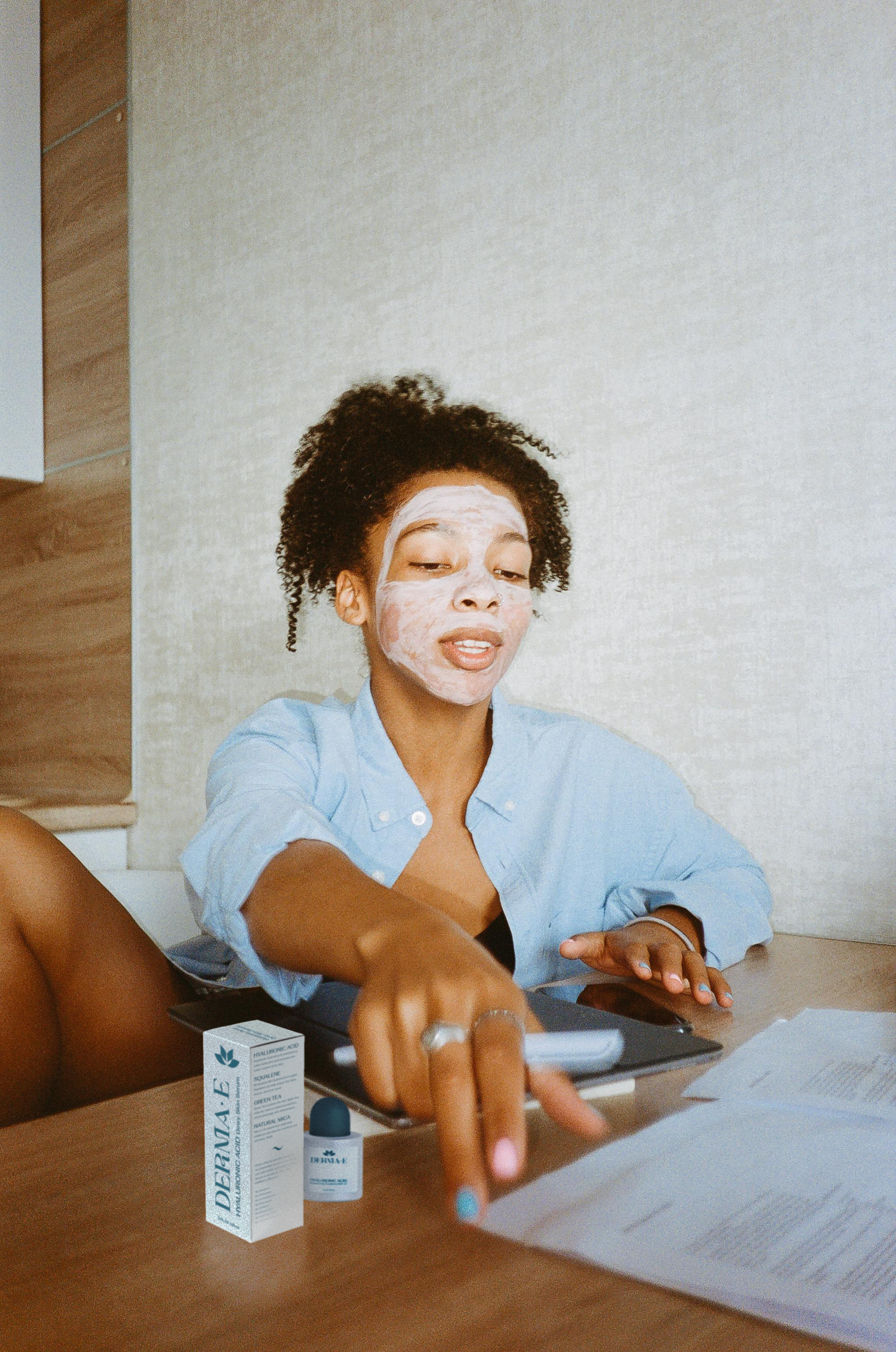
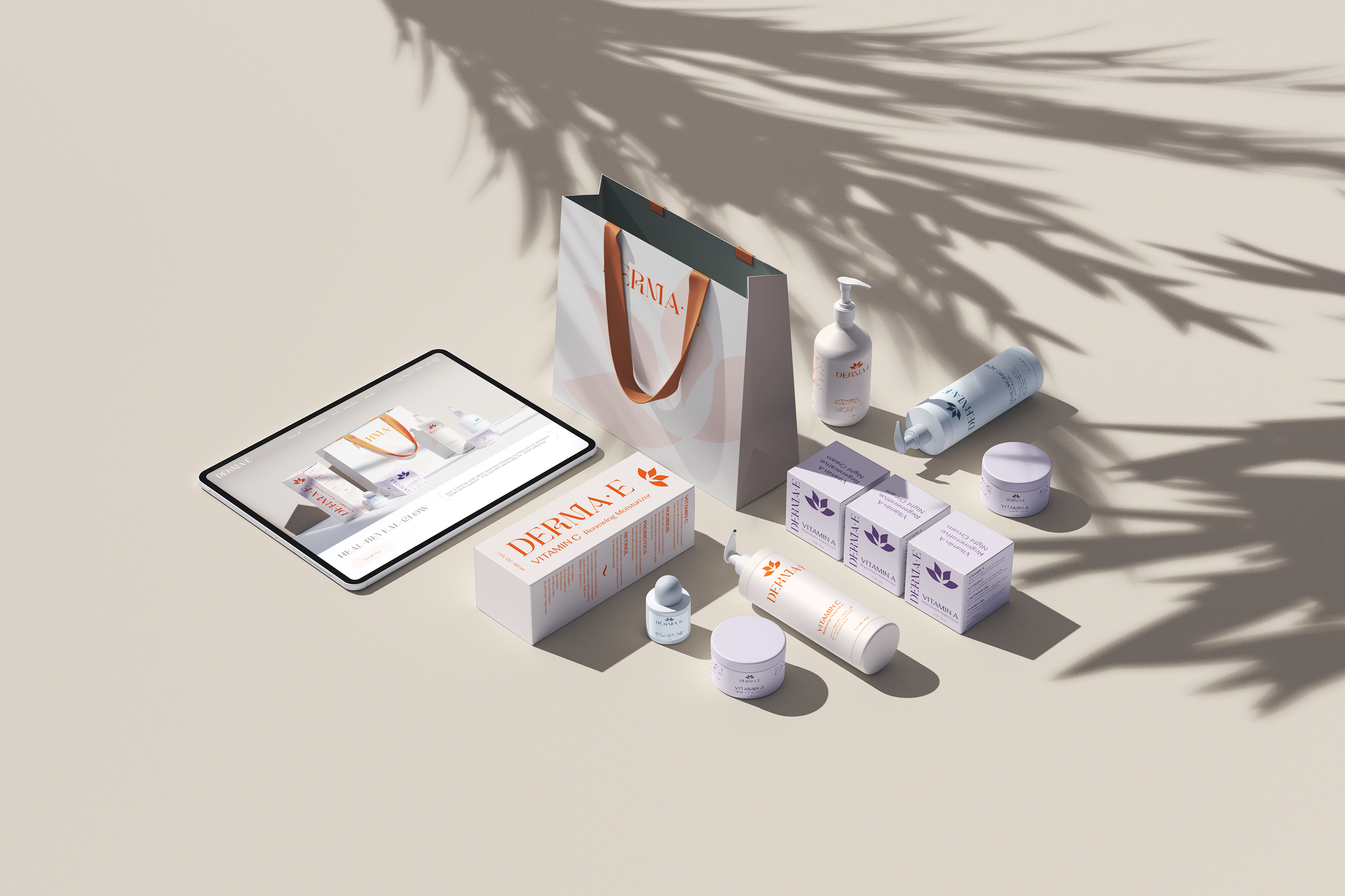
For the purpose of building a full vision of what I hope the redesign should look like, I spent some time creating even more mockups and labels that would match the products in the boxes. While this certainly moved into the realm of scope creep, I had a really fun time diving into what each product might be and adding all the little details that make this look like a product I would genuinely purchase for myself.
Mockups



Reflection
This was the first project that really sparked my interest in product design. It was particularly interesting creating custom dielines for each iteration of the box design from the original dimensions as well as the new sizes to fit the custom mockups.


